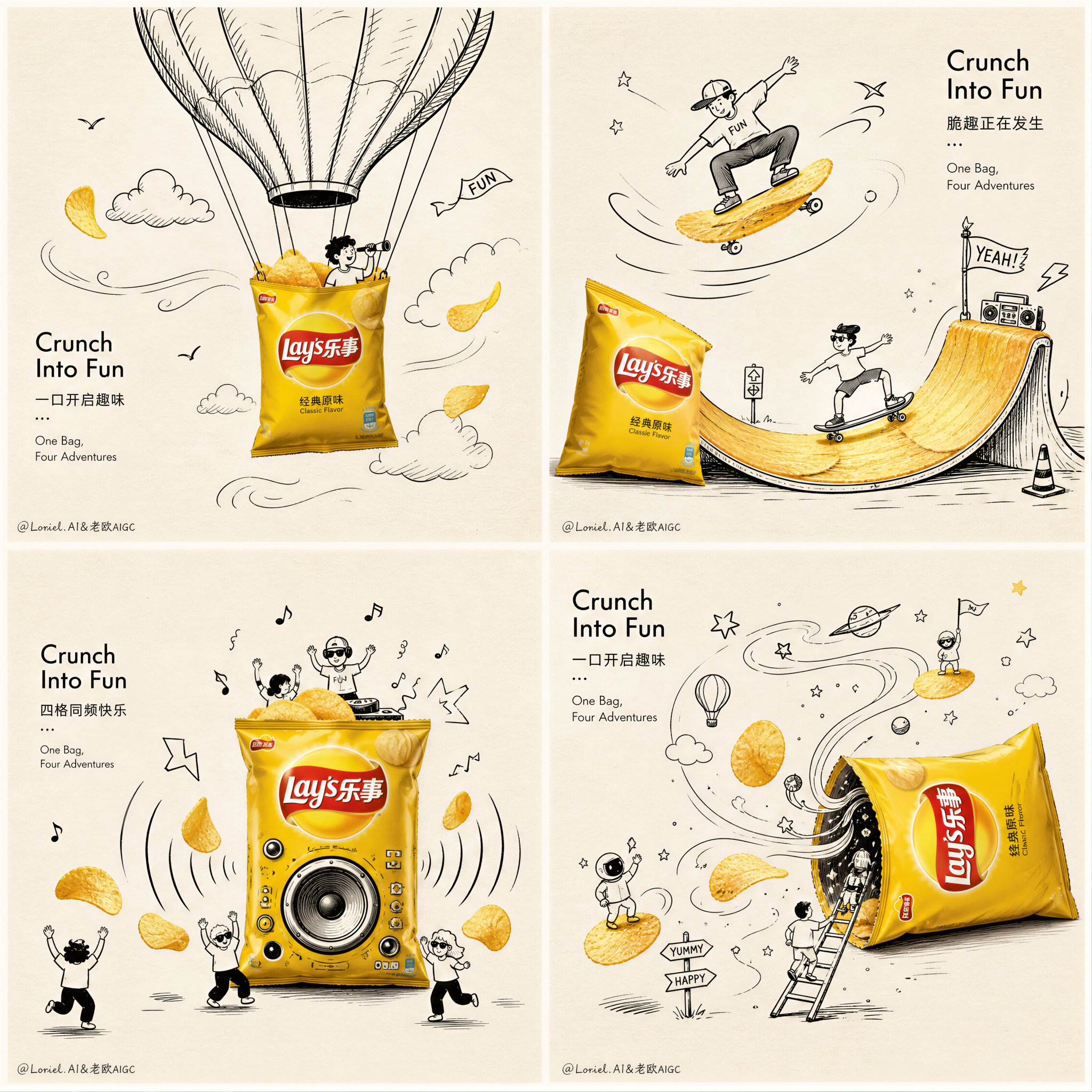
乐事薯片四格创意涂鸦广告插画
🤖 ChatGPT
🇨🇳 中文提示词
Create a premium 2x2 grid advertising artwork for Lay’s potato chips, one single image divided into four equal panels, all in the same clean conceptual style. The overall poster should feel witty, fresh, playful, highly designed, and visually interactive, with strong art-direction and collectible ad-poster quality.

Core visual language:
minimal warm off-white paper-texture background, lots of clean negative space, refined black-and-white hand-drawn doodle illustration, combined with realistic colorful Lay’s potato chip packaging and golden chips as the only strong color highlights. The mood is smart, humorous, light, graphic, and premium.

Layout:
a clean 2x2 composition, four square panels, evenly aligned, thin subtle spacing between panels, unified visual rhythm, same art style across all four scenes, like a campaign series presented in one page. Keep the image neat, balanced, and high-end.

Product:
Use iconic realistic Lay’s potato chips bag packaging as the hero object in every panel. The bag should look authentic, glossy, premium, instantly recognizable, with strong realistic volume, shadows, highlights, and crisp brand identity. Prefer classic bright yellow Lay’s pack as the main hero, or use a harmonious family of Lay’s colors if needed, but keep the campaign unified and clean.

Each of the four panels should show a different playful interaction between the real Lay’s bag / chips and the black doodle world:

Panel 1:
The Lay’s chip bag acts as a hot air balloon basket, floating upward. Hand-drawn doodle balloon canopy above, clouds, tiny birds, airflow lines, cheerful adventure icons. Golden potato chips fly around like wind-blown leaves.

Panel 2:
The Lay’s bag becomes a skateboard or surf ramp. Black line doodle characters slide across curved chips as if they are skate ramps or waves. Motion lines, stars, mini flags, playful action symbols. Strong sense of movement and energy.

Panel 3:
The Lay’s bag works as a music speaker or party amplifier. Doodle sound waves, dancing lines, tiny music notes, happy mini figures, chips bouncing outward like rhythm beats. The composition feels lively and punchy but still visually clean.

Panel 4:
The Lay’s bag becomes a doorway or portal into a doodle snack universe. Hand-drawn swirls, stars, floating chips, tiny ladders, adventurous mini people, playful arrows, and whimsical snack symbols emerging from the bag opening. The scene should feel imaginative and delightful.

Art direction:
The hand-drawn doodles must be elegant, controlled, witty, and compositionally smart, not childish scribbles. Use clean black ink lines, refined cartoon minimalism, soft humor, and subtle visual storytelling. The real product should interact directly with the doodles so the scene feels cleverly integrated, not pasted on top. Every panel should have one clear visual joke or interaction.

Chips:
Golden Lay’s potato chips should appear in all four panels as supporting heroes, realistic, crisp, lightly salted, appetizing, floating or interacting with the doodle world. Some chips can act like suns, wheels, stepping stones, surfboards, or flying objects, but all ideas must remain clean and readable.

Typography:
Add minimal but artistic campaign typography, clean and modern, integrated into the overall layout, not large messy headlines. Use a stylish mix of English and Chinese, with refined spacing and ad-design elegance. Suggested text:
“Lay’s”
“Crunch Into Fun”
“One Bag, Four Adventures”
Chinese text:
“乐事薯片”
“一口开启趣味”
“四格同频快乐”
“脆趣正在发生”
Typography should feel editorial, light, premium, and balanced with the visuals. Avoid crude heavy fonts.

Overall feel:
clean commercial illustration poster, conceptual packaging ad, modern minimal layout, clever visual interaction, witty and bright, premium campaign board, playful but sophisticated, high-end brand presentation, warm paper background, realistic product photography mixed with black ink doodle art, strong negative space, strong composition, 8k, hyper-detailed, unique, memorable.

Negative prompt:
messy layout, cluttered background, low detail, childish doodles, cheap design, distorted packaging, blurry logo, too many objects, overdecorated poster, dark background, random colors, weak interaction, flat composition, generic snack ad, unreadable text, extra products, low-end illustration
发表回复