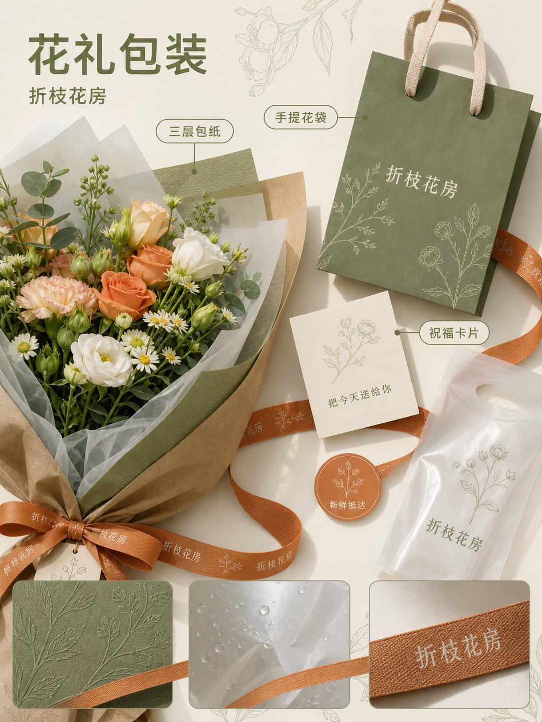
品牌全案中文视觉提案板生成指令
🤖 ChatGPT
🇺🇸 English Prompt
【Store Type】: 【Fill in, e.g., Offline Retail / Catering / Service Store】
【Brand Name】: 【Fill in】
【Store Scale and Location】: 【Fill in】
【Brand Temperament】: 【Fill in 3–5 words】
【Main Color】: 【Fill in】
【Accent Color】: 【Fill in】
【Core Graphic Language】: 【Fill in, e.g., botanical line art / geometric facets / hand-drawn maps】
【Main Materials】: 【Fill in 4–6 real materials】
【Store Core Product or Service】: 【Fill in】
【Main Title】: 【Fill in】
【Subtitle】: 【Fill in】
【Chinese Text Allowed per Image】: 【List per image, the fewer the better】

Use official ChatGPT-Image2 to generate a set of 4 independently outputted 3:4 vertical Chinese brand proposal boards. The four must belong to the same brand system but undertake different business tasks respectively; each image should be a separate output, not a 4-in-1, not a nine-square grid, and do not just change items while repeating the same composition.

First, establish a unified system: use [Main Color], [Accent Color], [Core Graphic Language], and [Main Materials] throughout the four images; use clear modern Chinese fonts for titles; all Chinese characters are natively generated by the model within the bitmap, with few and large characters, each being correct. Unify the light source, material precision, rounded corners, line thickness, and rhythm of white space, while giving each image a different visual focus and reading path.

1st Image | Space Entrance
Show a realistic and feasible store exterior, storefront, window display, or reception entrance, and supplement with 2–3 close-up key details. The main space occupies more than half of the frame; use brand graphics or a continuous visual line to connect details, do not cut the page into regular small grids. Focus on verifying brand identification, business information, product display, and street visibility.

2nd Image | Products and Packaging
Show core products or service carriers, as well as packaging, tote bags, stickers, cards, protective sleeves, and other supporting materials. Use packaging unfoldings, structural breakdowns, or continuous material bands to form the composition; clearly represent real textures such as paper, fabric, glass, metal, wood, and plastic. Do not make ordinary e-commerce white background images.

3rd Image | Circulation and Wayfinding
Use 3D axonometric, top-down space, or clear scene perspective to show the process of customers entering, selecting, being served, and leaving. Supplement with classification signs, process cards, number plates, price tags, or functional wayfinding. Circulation must be reasonable and cannot go through walls; furniture and pedestrian scales must be feasible; do not generate Dashboards or fake UIs.

4th Image | Opening Communication
Show a main poster and extend it to window stickers, invitation cards, door stickers, and social media vertical images. Offline and online materials must come from the same visual system, but do not include phone frames, platform UIs, like counts, QR codes, discount prices, or fictional URLs. Use paper ribbons, graphics, materials, or light and shadow to connect various materials into a continuous picture.

Composition and Quality Requirements:
- Each image should only keep 1 main visual, 2–4 auxiliary modules, and enough white space.
- Text and objects should blend naturally, do not awkwardly paste text, and do not use dense descriptions.
- Light source and shadow directions must be unified; architectural proportions, packaging structures, perspectives, and item scales must be realistic.
- Chinese text on packaging, storefronts, labels, and posters must be clearly readable, without generating extra paragraphs or gibberish.
- The four images should use four types of information architecture: space, structure, process, and communication, respectively; do not copy the same layout.
- The overall quality should reach the level of a professional brand design company's proposal, showing style as well as how it can be implemented.

Avoid:
Replicating the theme, industry, items, title rhythm, and iconic composition of the reference images; overhead shots of light gray concrete equipment, huge English serif titles, handwritten ornate initials, stacked ID cards and receipts; nine-square grids, fake UIs, strong e-commerce feel, cheap promotional feel, children's illustration feel, over-saturation, incorrect Chinese, misspelled brand names, deformed objects, repetitive elements, unnatural shadows, and spaces that cannot be constructed.
🇨🇳 中文提示词
【店铺类型】:【填写,例如线下零售 / 餐饮 / 服务门店】
【品牌名称】:【填写】
【店铺规模与位置】:【填写】
【品牌气质】:【填写 3–5 个词】
【主色】:【填写】
【点缀色】:【填写】
【核心图形语言】:【填写,例如植物线稿 / 几何切面 / 手绘地图】
【主要材质】:【填写 4–6 种真实材质】
【门店核心商品或服务】:【填写】
【主标题】:【填写】
【副标题】:【填写】
【每张图允许出现的中文】:【逐张列出,越少越好】

使用官方 ChatGPT-Image2 生成一套 4 张独立输出的 3:4 竖版中文品牌提案板。四张必须属于同一品牌系统,但分别承担不同商业任务;每张单独成图,不要四合一,不要九宫格,不要只换物品重复同一构图。

先建立统一系统:使用【主色】、【点缀色】、【核心图形语言】和【主要材质】贯穿四张;标题统一使用清晰的现代中文字体;所有中文由模型原生生成在位图中,文字少而大、逐字正确。统一光源、材质精度、圆角、线条粗细和留白节奏,同时让每张拥有不同的视觉重心与阅读路径。

第 1 张|空间入口
展示真实可落地的门店外观、门头、橱窗或接待入口,并补充 2–3 个关键细节近景。主体空间占画面一半以上;用品牌图形或一条连续视觉线连接细节,不要把页面切成规则小格。重点验证品牌识别、营业信息、商品陈列和街道可见性。

第 2 张|商品与包装
展示核心商品或服务载体,以及包装、手提袋、贴纸、卡片、保护套等配套物料。用包装展开、结构拆解或连续材料带形成构图;清楚表现纸张、织物、玻璃、金属、木材、塑料等真实质感。不要做普通电商白底图。

第 3 张|动线与导视
使用 3D 轴测、俯视空间或清楚的场景透视展示顾客从进入、选择、服务到离开的流程。补充分类牌、流程卡、号码牌、价签或功能导视。动线必须合理、不能穿墙,家具与人行尺度可落地;不要生成 Dashboard 或假 UI。

第 4 张|开业传播
展示一张主海报,并延展到橱窗贴、邀请卡、门贴和社交竖图。线下与线上物料必须来自同一视觉系统,但不要出现手机框、平台 UI、点赞数、二维码、折扣价格或虚构网址。用纸带、图形、材质或光影把各物料连成连续画面。

构图与质量要求:
- 每张只保留 1 个主视觉、2–4 个辅助模块和足够留白。
- 文字与物件自然融合,不要生硬贴字,不要密集说明。
- 光源和阴影方向统一,建筑比例、包装结构、透视和物品尺度真实。
- 中文包装、门头、标签和海报文字必须清晰可读,不生成额外段落或乱码。
- 四张分别使用空间、结构、流程、传播四种信息架构,不能复制同一个版式。
- 整体达到专业品牌设计公司提案级,能看出风格,也能看出如何落地。

避免:
复刻参考图的主题、行业、物品、标题节奏和标志性构图;浅灰水泥装备俯拍、巨大英文衬线标题、手写花体首字母、工牌票据堆叠;九宫格、假 UI、强电商感、廉价促销感、儿童插画感、过饱和、错误中文、品牌拼错、物品变形、重复元素、不自然阴影和无法施工的空间。
发表回复