博客

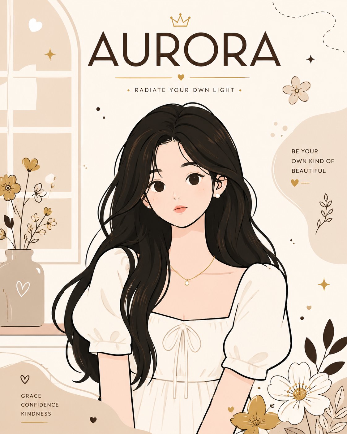
  • 极简矢量风格时尚海报AURORA

    极简矢量风格时尚海报AURORA

    极简矢量风格时尚海报AURORA


    🤖 ChatGPT

    🇺🇸 English Prompt

    Playful flat-vector poster illustration of the reference woman in a graceful front-facing portrait pose, wearing a delicate white puff-sleeve dress and minimalist jewelry, set in a bright airy interior with soft abstract window shapes and elegant decorative elements. Use clean, thick black outlines, simple rounded geometric shapes, flat solid color fills, minimal facial details, small neutral eyes, a calm deadpan expression, simplified body proportions, pastel color blocking, sparse floral doodles, tiny abstract sparkles, clean negative space, crisp graphic poster layout, and a controlled cream, warm beige, soft brown, and muted gold color palette. Add the name "AURORA" in bold, modern typography integrated naturally into the poster design. Style: Cute minimalist flat vector, editorial fashion poster aesthetic, high-contrast outlines, smooth geometric construction, sophisticated yet playful composition, premium graphic design, no gradients, no realistic textures, no shadows, flat colors only, elegant feminine branding, aspect ratio 4:5.

    🇨🇳 中文提示词

    顽皮的平涂矢量海报插画,参考女性以优雅的正向肖像姿势,穿着精致的白色泡泡袖连衣裙和极简主义珠宝,置于明亮通风的室内,带有柔和的抽象窗户形状和优雅的装饰元素。使用干净、粗大的黑色轮廓,简单的圆形几何形状,平整的纯色填充,极简的面部细节,细小的中性眼睛,冷静的面无表情,简化的身体比例,柔和的色块,稀疏的花卉涂鸦,微小的抽象闪烁,干净的留白,清爽的图形海报布局,以及受控的奶油色、暖米色、柔和的褐色和哑光金色调。加入加粗的现代排版名称“AURORA”,自然地融入海报设计中。风格:可爱极简平涂矢量,社论时尚海报美学,高对比度轮廓,平滑的几何结构,精致而顽皮的构图,优质图形设计,无渐变,无真实纹理,无阴影,仅限平铺颜色,优雅的女性品牌,长宽比 4:5。
  • 夏日放风筝新中式少女POV超写实人像

    夏日放风筝新中式少女POV超写实人像

    夏日放风筝新中式少女POV超写实人像


    🤖 ChatGPT

    🇺🇸 English Prompt

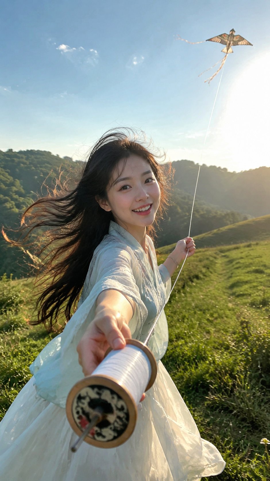
    Create a 9:16 ultra-realistic POV summer kite flying portrait.
    
    A young adult East Asian woman, 20–25 years old, with a soft first-love appearance, bright eyes, and a natural lively smile, hands a traditional wooden kite reel toward the camera. The image should feel like a real phone snapshot during a summer outing.
    
    Strong summer wind blows her long black hair, sleeves, skirt hem, and the kite string in the same direction. A small traditional kite is visible in the distant sky. Bright sunny side backlight creates golden rim light on her flying hair and light fabric.
    
    She wears a lightweight summer new Chinese-style outfit, fresh and breathable, not heavy ancient costume. The upper garment should be light but structured, naturally fitting and supporting the adult female upper-body silhouette, with soft shoulder lines, natural waistline, and elegant proportion.
    
    Background: sunny hillside, open grassland, wildflower field, mountain slope, or riverside wooden path. Realistic skin texture, natural pores, no heavy retouching, no plastic skin, no glossy face.
    
    Avoid thick robes, winter costume, stiff posing, weak wind, short hair, modern plastic reel, no kite in the sky, emotionless smile, heavy makeup, distorted hands, watermark, text, logo, CGI look.

    🇨🇳 中文提示词

    创建一个9:16超写实的POV夏日放风筝肖像。
    
    一位20-25岁的东亚年轻女性,拥有温柔的初恋脸、明亮的眼睛和自然活泼的笑容,正向镜头递出一个传统的木制风筝线轴。图像应该感觉像是夏日出游时的真实手机快照。
    
    强劲的夏风将她的黑色长发、衣袖、裙摆和风筝线吹向同一方向。远处的空中可以看到一只传统小风筝。明亮的晴天侧逆光在她的飞舞长发和轻薄面料上营造出金色的轮廓光。
    
    她穿着轻便的夏季新中式服装,清新透气,不是厚重的古装。上衣应轻盈但有型,自然贴合并支撑成年女性的上身轮廓,具有柔和的肩线、自然的腰线和优雅的比例。
    
    背景:阳光明媚的山丘、开阔的草地、野花田、山坡或河边木栈道。写实的皮肤纹理,自然的毛孔,无重度修图,无塑料感皮肤,无油光面部。
    
    避免厚重的长袍、冬季服装、僵硬的姿势、微风、短发、现代塑料线轴、天空中没有风筝、毫无感情的微笑、浓妆、扭曲的手部、水印、文字、标志、CGI感。
  • 巴黎左岸主厨品鉴菜单九宫格海报

    巴黎左岸主厨品鉴菜单九宫格海报

    巴黎左岸主厨品鉴菜单九宫格海报


    🤖 ChatGPT

    🇨🇳 中文提示词

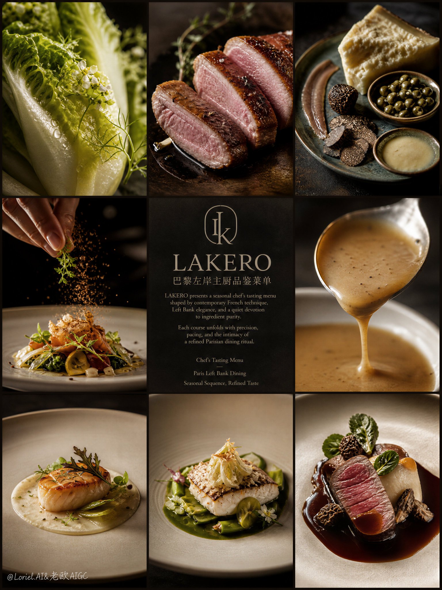
    Create an ultra-premium 3x3 editorial poster for LAKERO, reimagined as a Paris Left Bank chef’s tasting menu campaign. The image should feel like a Michelin-level French dining identity piece rooted in Left Bank sophistication: intellectual, poetic, intimate, culinary, and quietly luxurious. The overall mood must merge chef-driven gastronomy, seasonal tasting-menu rhythm, and the refined cultural atmosphere of a high-end Parisian rive gauche restaurant.
    
    Use a strict nine-panel grid composition with three columns and three rows, precise borders, elegant spacing, and calm editorial balance. The visual system should feel architectural, restrained, and magazine-worthy, like an haute cuisine tasting menu story told through ingredient studies, plated dishes, chef gestures, and refined typography. The composition must feel unified, graceful, and deeply curated rather than busy or commercial.
    
    The key concept is:
    LAKERO as a Paris Left Bank fine-dining destination,
    presenting a chef’s seasonal tasting menu shaped by restraint, precision, narrative pacing, and modern French elegance.
    The poster should feel like a culinary manifesto for an intimate restaurant where each course is part of a thoughtful progression.
    This is not a menu board and not a casual food collage.
    It must feel like an elite gastronomic brand campaign.
    
    Design the nine panels as a tasting-menu journey, for example:
    
    Panel 1:
    an ultra-close macro of a refined seasonal ingredient, such as baby gem lettuce, white asparagus, delicate herbs, endive, or edible flowers, rendered with visible moisture, fine structure, and poetic sculptural light.
    
    Panel 2:
    a close-up of a chef-precise protein preparation, such as duck breast, roasted chicken supreme, butter-poached fish, or veal medallion, showing elegant sear, tenderness, and refined French technique.
    
    Panel 3:
    a still life of elevated tasting-menu elements, such as beurre noisette, aged comte, shaved truffle, capers, anchovy fillet, citrus zest, artisan crumb, or cultured butter, arranged with Left Bank editorial restraint.
    
    Panel 4:
    a dynamic finishing moment, such as sauce being brushed, garnish being placed, crumbs falling, shaved cheese descending, or herbs being scattered, captured with extreme realism and chef-level precision.
    
    Panel 5:
    the central information panel on a deep charcoal, warm black, or Parisian stone-toned background, featuring a bespoke minimalist LAKERO logo and refined tasting-menu introduction typography.
    
    Panel 6:
    a luxurious sauce or emulsion close-up, lifted from a spoon or gently poured, with silky viscosity, subtle gloss, and exceptional material realism, expressing culinary refinement and sensual control.
    
    Panel 7:
    a complete plated tasting-menu course viewed with elegant negative space, refined porcelain or matte ceramic plateware, precise garnish logic, and Michelin-level compositional discipline.
    
    Panel 8:
    another course from the tasting progression, such as a warm starter, composed seasonal salad, vegetable-focused plate, or seafood course, rendered with layered texture and Parisian restraint.
    
    Panel 9:
    the final hero course panel, showing the most iconic LAKERO tasting-menu presentation in a fully resolved haute cuisine composition, intimate and luxurious, completing the culinary narrative.
    
    The center panel must establish LAKERO as an intellectually refined Paris Left Bank restaurant brand.
    Create an original bespoke LAKERO logo:
    minimal,
    architectural,
    Parisian,
    editorial,
    timeless,
    and internationally premium.
    The logo may use a monogram or subtle emblem inspired by French hospitality, menu cards, table ritual, wrought-iron geometry, or the quiet symmetry of Left Bank architecture.
    It must feel expensive, cultured, and calm, never trendy or ornamental.
    
    Typography should follow a refined Paris Left Bank editorial system.
    Use:
    main English title: “LAKERO”
    small Chinese subtitle: “巴黎左岸主厨品鉴菜单”
    Add elegant English introduction copy such as:
    “LAKERO presents a seasonal chef’s tasting menu shaped by contemporary French technique, Left Bank elegance, and a quiet devotion to ingredient purity.
    Each course unfolds with precision, pacing, and the intimacy of a refined Parisian dining ritual.”
    Optional supporting English lines may include:
    “Chef’s Tasting Menu”
    “Paris Left Bank Dining”
    “Seasonal Sequence, Refined Taste”
    Typography must feel literary, couture-editorial, spacious, and quietly authoritative, with beautiful hierarchy and luxury print discipline.
    Avoid generic menu fonts, loud graphic display type, or cluttered copy.
    
    The cuisine must be rendered with exceptional realism and chef-driven delicacy:
    micro moisture on produce,
    fine roasted textures,
    silky sauces,
    subtle fibers in meat and vegetables,
    precise crumb detail,
    clean plate rims,
    and highly controlled garnish placement.
    Every course should feel intelligent, seasonal, and Michelin-calibrated, never rustic, heavy, or casual.
    
    Lighting must be soft, intimate, and cinematic:
    deep but breathable shadows,
    gentle directional highlights,
    subtle gloss on sauces,
    quiet reflections on plateware,
    and elegant tonal falloff across the entire grid.
    The atmosphere should feel like candlelit Parisian refinement translated into editorial studio photography.
    
    Color palette should reflect Paris Left Bank sophistication:
    warm black,
    deep charcoal,
    stone gray,
    ivory,
    butter cream,
    sage green,
    olive,
    champagne beige,
    soft roast gold,
    and restrained linen tones.
    The palette must remain subtle, cultivated, and poetic, never over-saturated or aggressively commercial.
    
    Backgrounds across the panels must remain minimal and premium:
    dark stone surfaces,
    matte black tabletops,
    soft Parisian shadow,
    warm neutral studio backdrops,
    and refined negative space.
    No casual interiors, no visible diners, no alcohol-centered hero object, no cluttered props.
    Everything must feel chef-led, cultured, intimate, and unmistakably haute cuisine.
    
    Overall mood:
    Parisian, Left Bank, chef-driven, Michelin-inspired, poetic, intellectual, intimate, refined, gastronomic, editorial, luxurious, world-class.
    
    Rendering style:
    hyper-realistic fine-dining food photography, Paris Left Bank chef’s tasting menu editorial grid, bespoke LAKERO restaurant logo, elegant literary typography, soft cinematic luxury lighting, ultra-detailed ingredient realism, Michelin-level plate styling, haute cuisine branding campaign, 8k, world-class commercial quality.
    
    Negative prompt:
    alcohol hero theme, bottle-centered composition, cheap menu board, casual dining mood, rustic bistro clutter, overly colorful scene, flat lighting, generic logo, crowded typography, fast food styling, cartoon food, messy plating, brochure layout, noisy props, bright commercial background, low-end restaurant branding
  • 韩国女偶像九宫格写真拼图

    韩国女偶像九宫格写真拼图

    韩国女偶像九宫格写真拼图


    🤖 ChatGPT

    🇺🇸 English Prompt

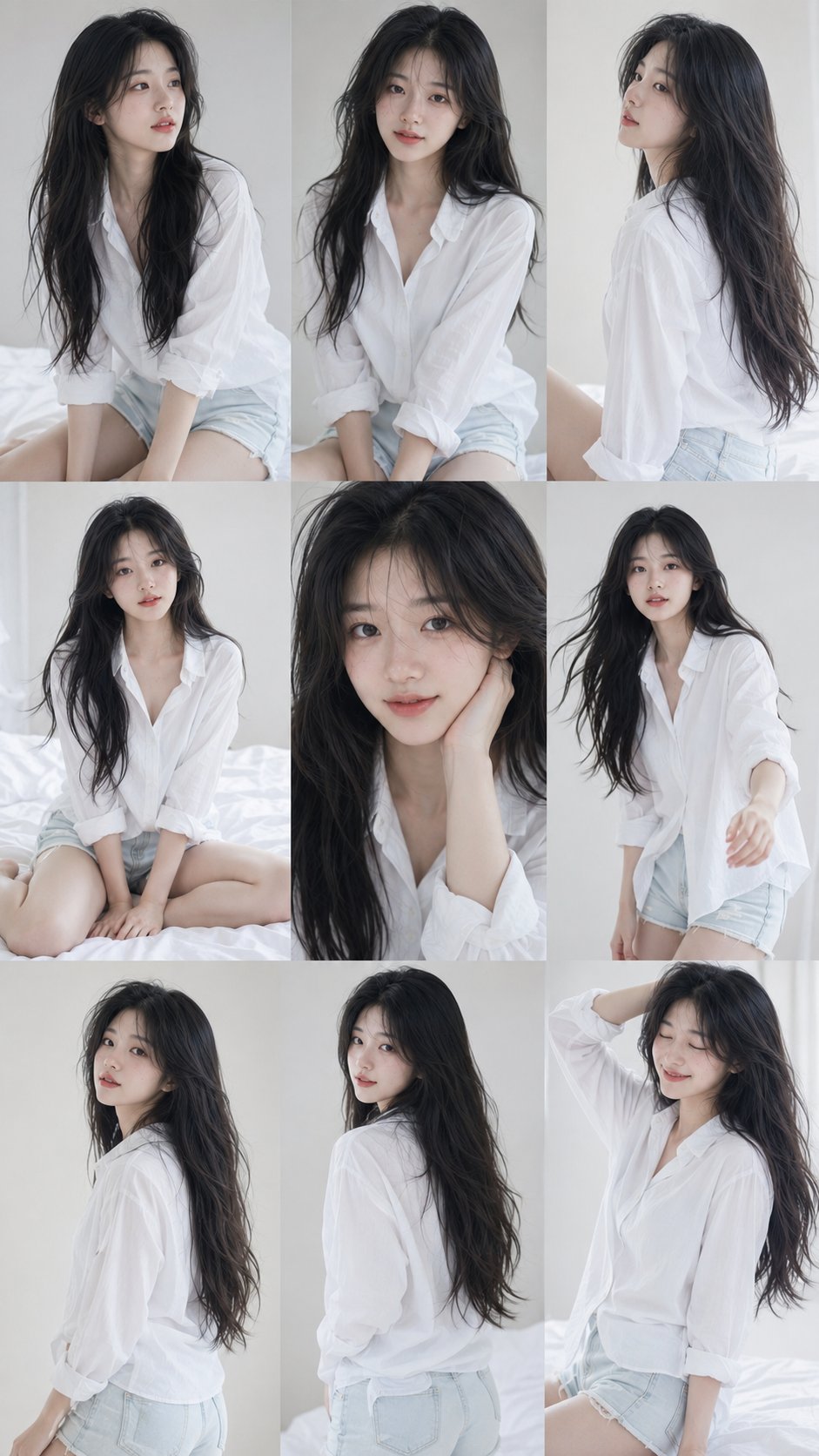
    Create a 9:16 vertical 3×3 Korean idol photobook collage featuring the same young Korean female model in all nine frames, with 100% consistent facial identity, same eyes, nose, lips, face shape, hairstyle, and body proportions throughout.
    
    Long black natural wavy hair, soft Korean minimal makeup, clear realistic skin texture, wearing an oversized white shirt with light denim shorts. White minimalist indoor studio background, soft natural window light, dreamy clean aesthetic, subtle film grain, ultra-realistic photography.
    
    Nine different candid poses: looking away, front portrait, side profile, sitting pose, close-up selfie style, walking pose, back view, soft smile, playful expression. High-resolution realistic K-fashion idol photoshoot, elegant and natural.

    🇨🇳 中文提示词

    创建一个 9:16 垂直 3×3 韩国偶像写真集拼贴,在所有九个画框中展示同一位年轻的韩国女性模特,具有 100% 一致的面部特征,相同的眼睛、鼻子、嘴唇、脸型、发型和全身比例。长黑自然波浪发,柔和的韩系极简妆容,清晰真实的皮肤纹理,身穿一件大廓形白色衬衫配浅色牛仔短裤。白色极简主义室内摄影棚背景,柔和的自然窗光,梦幻干净的美学,微妙的胶片颗粒感,超写实摄影。九种不同的自然姿势:望向别处、正面肖像、侧面轮廓、坐姿、特写自拍风格、行走姿势、背面、温柔的微笑、俏皮的表情。高分辨率写实韩系时尚偶像拍照,优雅且自然。
  • 明亮清透大字背景线描容器平面海报

    明亮清透大字背景线描容器平面海报

    明亮清透大字背景线描容器平面海报


    🤖 ChatGPT

    🇺🇸 English Prompt

    Create a bright and clear flat poster-style image centered around specific theme content. First, transform the core keywords of the theme into a line of extremely thick sans-serif large characters, let the letterforms form a huge structural background at the top of the image. The surfaces of the characters feature subtle paper textures and semi-transparent printed grains, with portions naturally cropped by the boundaries of the image, serving only as a clear visual wall without excessively overshadowing the main subject. Place the main subject near the central axis of the frame, use a line-drawn container resembling a childhood handmade cutout to support the theme's symbolic objects: the container is represented by a single-line outline, the rim and bottom use elliptical lines to form a transparent space, and inside, several slender straight stems, rounded blunt leaves, and simplified block-shaped flower forms emerge, shapes look like layered paper cutouts, with edges that are clean, geometric, and carry slight handmade imperfections. The information layer remains sparse, scatter small-sized months, numbers, or theme node text on both sides of the main subject using rounded bold fonts, colors correspond and echo with the small graphics; at the bottom, keep two sets of short paragraphs and a tiny signature-style footer, letter spacing and line spacing are tight but still clear, creating the reading rhythm of a childlike infographic. Colors are extracted from the theme's own season, material, and emotion: the background takes up a large area of high-brightness clean ground, the main title uses bright structural colors that can vary between warm and cool, the main subject's stems or framework use clear, high-saturation support colors, flowers or symbolic blocks use a small amount of bright accent colors, and small text is assigned from these accent colors; overall maintaining a bright and light feel, strong airiness, clear color levels, saturated but not muddy, paper texture only provides a soft tactile feel without creating a sense of age. The focus of the image is the scale contrast between the oversized text background and the central line-drawn container, as well as the lighthearted order of childlike graphics, negative space, and small informational text.

    🇨🇳 中文提示词

    围绕具体主题内容生成一张明亮清透的平面海报感画面,先把主题核心词转化为一行极粗无衬线大字,让字形在画面上方形成巨大的结构背景,字面带轻微纸纹和半透明印刷颗粒,局部被画面边界自然裁切,只作为清晰的视觉墙而不过度抢走主体。主体放在画面中轴附近,用幼年手工剪贴般的线描容器承托主题象征物:容器以单线轮廓表示,口沿和底部用椭圆线形成透明空间,内部伸出几条细长直杆、圆钝叶片和简化块面花形,形状像剪纸叠片,边缘干净、几何化、略带手作偏差。信息层保持稀疏,在主体两侧散放小号月份、编号或主题节点文字,使用圆润粗体,颜色与对应小图形互相呼应;下方保留两组短段落与极小署名式页脚,字距和行距紧密但仍清楚,形成童趣信息图的阅读节奏。色彩从主题自身的季节、材质与情绪中提取:背景承担大面积高明度洁净底场,主标题使用明亮冷暖可变的结构色,主体枝干或骨架使用清晰高饱和支撑色,花朵或象征块面使用少量明亮强调色,小文字从这些强调色中分配;整体保持明亮轻快、通风感强、色阶清楚、饱和但不浑浊,纸纹只提供柔和触感而不制造陈旧感。画面重点是超大文字背景与中心线描容器之间的尺度反差,以及童稚图形、空白场和小型信息文字的轻快秩序。
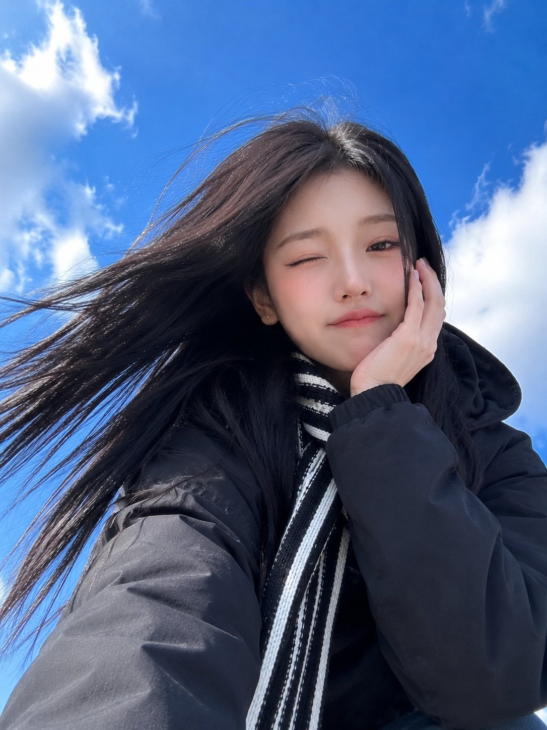
  • 蓝天背景仰拍加油姿势东亚美女手机自拍

    蓝天背景仰拍加油姿势东亚美女手机自拍

    蓝天背景仰拍加油姿势东亚美女手机自拍


    🤖 ChatGPT

    🇺🇸 English Prompt

    Ultra-realistic smartphone selfie of a beautiful young East Asian woman taken from a dramatic low-angle perspective against a vivid blue sky with soft white clouds. She has long straight jet-black hair flowing naturally in the wind, fair porcelain skin, soft almond-shaped brown eyes, subtle winged eyeliner, natural pink lips, and a playful expression with her lips gently pressed together. She raises one fist in the air in a cute cheering pose while looking directly into the camera. She wears an oversized black hooded coat layered with a black-and-white striped knitted scarf wrapped around her neck, small silver stud earrings, and minimal Korean makeup. Bright natural daylight, soft sunlight, realistic skin texture, authentic iPhone front-camera look, slight wide-angle lens distortion, candid outdoor snapshot, vibrant blue sky, clean composition, shallow depth of field, photorealistic, ultra-detailed, 4K, documentary lifestyle photography.
    anime, cartoon, CGI, illustration, blurry, low quality, overprocessed, plastic skin, extra fingers, bad anatomy, duplicate limbs, watermark, logo, text, oversaturated colors, unrealistic lighting, distorted face

    🇨🇳 中文提示词

    极具写实感的智能手机自拍,一位美丽的年轻东亚女性,采用戏剧性的低角度拍摄,背景是鲜艳的蓝天和柔和的白云。她留着一头自然地在风中飘动的黑色长直发,皮肤白皙如瓷,温柔的棕色杏仁眼,细微的翼状眼线,自然的粉色嘴唇,表情调皮,双唇轻轻地抿在一起。她向空中举起一只拳头,摆出可爱的加油姿势,同时直视镜头。她穿着一件廓形黑色连帽大衣,叠搭着一条围在脖子上的黑白条纹针织围巾,戴着精巧的银色耳钉,化着极简韩系妆容。明亮的自然日光,柔和的阳光,真实的皮肤纹理,真实的iPhone前置摄像头质感,轻微的广角镜头畸变,自然的户外抓拍,充满活力的蓝天,简洁的构图,浅景深,写实摄影,超高细节,4K,纪实生活方式摄影。
    动漫,卡通,CGI,插画,模糊,低质量,过度处理,塑料感皮肤,多余的手指,拙劣的解剖结构,重复的肢体,水印,标志,文字,过度饱和的色彩,不真实的光影,扭曲的面部
  • ChatGPT语音终于学会闭嘴:OpenAI GPT-Live全双工上线

    ChatGPT语音模式升级示意
    OpenAI 用 GPT-Live 重写 ChatGPT 语音模式,让它学会”边听边说”(图:The Verge)

    用过 ChatGPT 语音模式的朋友大概都经历过这种尴尬:你话才说到一半,正组织下一句,AI 突然插进来”好的,我理解你的意思是……”,而你后面那半句它压根没听见。这不是你表达有问题,是旧版语音模型的底层架构决定的——它只能等你彻底闭嘴,才轮到它开口。

    7 月 8 日,OpenAI 给这个问题从根上动了刀。新发布的 GPT-Live-1 和 GPT-Live-1 mini 两款语音模型,第一次在 ChatGPT 里实现了”全双工”:它能一边听你说话,一边组织自己的回答,你随时可以打断、插话、改口,它都接得住。

    “它终于学会闭嘴了”

    The Verge 给这篇报道起的标题特别传神——”ChatGPT 升级后的语音模式更擅长闭嘴了”。OpenAI 产品负责人 Atty Eleti 在发布会上解释:”这是一个全双工模型,意味着它可以同时说话和听。从模型侧看,它能持续、同时地处理输入流、产出输出流。”

    OpenAI 研究负责人 Kundan Kumar 把 GPT-Live-1 称为公司”迄今最聪明的语音模型”。它会在需要推理或联网搜索时,自动把你的请求转交给 GPT-5.5 这类最强文本模型,再回头把结论用说话的方式讲给你听。

    换句话说,以前语音助手是”听写—理解—朗读”三段流水线,现在声音本身就是输入也是输出,延迟从秒级压到了毫秒级,对话节奏终于像人跟人聊天了。

    几个真实用得上的新花样

    全双工带来的不只是”不打断你”这么简单,还顺手解锁了几个挺实用的能力:

    • 实时翻译:你还在说中文,它已经同步翻成英文,不用等你停下
    • “听口令再开口”:你可以让它先闭嘴,等你喊它才接话
    • 会”嗯、对、收到”:它用这些词告诉你”我在听”,对话更自然
    • 聊天气、股票、赛事时,会顺手生成对应的图片辅助说明

    OpenAI 说,新版语音模式就是为了让人能”更长时间地 Hands-free 聊天”。产品负责人 Eleti 自己就说,他散步时跟语音助手聊过 30 到 40 分钟。看得出来,OpenAI 想让 ChatGPT 从一个”要打字的工具”,变成一个”能一直挂着的对话入口”。


    不是 AI 伴侣,也还有翻车的时候

    OpenAI 特意划了一条线:GPT-Live 不是要做”AI 伴侣”,不打算跟你谈情说爱。它内置了 safeguards,对青少年给年龄合适的回答,聊到自伤这类话题会转接专业危机热线。毕竟 OpenAI 正背着一串”ChatGPT 诱发妄想、伤害用户心理健康”的官司,安全这块不敢马虎。

    不过 demo 也不是完美。展示印地语实时翻译时,助手带着一股浓重的美式口音,印地语说得生硬又书卷气。OpenAI 承认新模型针对”大多数主流语言”做了优化,但没说清到底是哪些。这也是全双工语音要真正好用,还得跨过的一道坎。

    谁能先用上

    GPT-Live-1 已经推到 iOS、安卓和网页端。Go、Plus、Pro 订阅用户默认用更大的 GPT-Live-1,免费用户则是轻量版的 GPT-Live-1 mini。苹果和亚马逊也在把自家的语音助手往”更会接话、更懂上下文”的方向改,Sesame 这类创业公司也在做类似的事。语音这条赛道,下半年只会更挤。

    对普通用户来说,最直观的变化可能就是:以后跟 ChatGPT 打电话,它终于不会在你喘气的功夫抢话了。

  • 微软在Excel里悄悄换掉OpenAI:自研MAI接管Office

    微软总部与Office办公场景
    微软正把自研MAI模型悄悄塞进Excel和Word的AI功能里(图:Getty Images)

    过去两年,微软给外界的印象一直是”OpenAI 最铁的盟友”——Copilot 背后站着 GPT,Office 365 的不少智能功能都贴着 OpenAI 和 Anthropic 的标。但彭博社 7 月 7 日的一则报道把这个默契撕开了一道口子:在 Excel 和 Word 里,已经有相当一部分用户提问,不再交给 OpenAI 或 Anthropic,而是由微软自己的 MAI 模型来回答。

    具体数字没公开,但彭博说,每个星期这两款软件里已经有”数万条”AI 提示词是 MAI 在处理。别看占比还小,放到 Excel 和 Word 这种亿级用户的产品里,这已经是微软第一次把自研模型悄悄塞进了核心办公场景的台前,而不只是躲在测试环境里。

    从 Excel 和 Word 开始,微软动了”外人”的奶酪

    有意思的是,微软自己从没高调宣传过这步棋。以前它巴不得你记得 Office 365 是”由 OpenAI 和 Anthropic 的模型驱动”;现在它选择了闷声干。TechCrunch 找微软求证,对方只回了一句”暂无更多信息可以分享”。这种不否认也不解释的态度,某种程度上比一份正式声明更说明问题。

    微软 AI 模型业务负责人穆斯塔法·苏莱曼(Mustafa Suleiman)在 6 月 Build 大会上说得直白:”我们每年向 Anthropic 支付巨额费用,目标是逐步减少、并最终消除这部分支出。”

    一句话把动机说透了:不是不想用,是太贵了。

    七个模型一起上,MAI 到底是什么来头

    MAI 不是临时起意。就在今年 6 月的 Build 开发者大会上,微软一口气发布了 7 款全新的自研 AI 模型,覆盖语音、图像、代码和推理——其中包括一个能写代码的 agentic coder,以及一个文生图模型。也就是说,微软已经在为”逐步替换第三方”悄悄准备弹药了。

    这些模型的卖点很统一:不追求纸面参数多吓人,而是强调”同样的活儿,花更少的算力”。放在 Office 这种每天海量、高频、但单次并不复杂的调用场景里,自研模型的成本优势会被放大。再配合微软自己的 Maia AI 芯片做软硬协同,推理开销比外购方案低上一截。

    • MAI-Transcribe-1 / MAI-Voice-1:对标 OpenAI Whisper 的语音转录与生成
    • MAI-Image-2:图像生成,替代部分文生图需求
    • MAI Code 1 Flash:面向开发者的代码生成模型
    • MAI Thinking 1:主打轻量高频办公场景的推理模型

    除了 Office 套件,MAI 也已经接进了 GitHub Copilot;Teams 上自研的语音转写能力也计划在几个月内上线。微软的意思很明确:凡是能自己干的,就别再长期花钱请外援。


    不只是微软,整个硅谷都在”省 token”

    把镜头拉远一点,微软这步其实是一股大潮里的一朵浪。今年上半年还流行”tokenmaxxing”——能多烧就多烧,把智能拉满;最近几个月画风突变,Amazon、Uber、Meta、Accenture 都被曝在收紧员工的 AI 预算,能省则省。AI 服务的账单一出来,连硅谷自己人都被吓到。

    更戏剧性的是,成本压力甚至把一些公司推向了”对手阵营”。有报道说,硅谷已经有人开始盯着中国的便宜模型(比如 GLM-5.2)找 Agent 方案,虽然绕不开安全和合规的顾虑。这说明一件事:当账单足够疼,地缘和安全的优先级都会往后挪一挪。

    自研到底,是想把命门攥回自己手里

    微软当然不会明天就跟 OpenAI、Anthropic 说拜拜。它手里还握着和 OpenAI 的合作协议,只是折扣窗口正在收窄。苏莱曼团队真正在做的,是搭一套”自主可控”的模型体系,免得将来被头部实验室的市场价拿捏。

    这也折射出整个行业的尴尬:靠外购大模型做商业化,盈利模型到现在都没完全跑通。微软这次把自研模型塞进 Excel 和 Word,看起来是省几块钱的小动作,实则是大厂为”AI 主权”交的第一笔学费。接下来,GitHub Copilot、Teams,甚至 Bing,会不会也慢慢换上 MAI,值得盯着看。

  • Next AI Draw.io:用自然语言一句话生成 draw.io 架构图的 AI 绘图神器

    Next AI Draw.io:用自然语言一句话生成 draw.io 架构图的 AI 绘图神器

    还在为画架构图、流程图熬夜对峙 draw.io?Next AI Draw.io 让你用一句话描述需求,AI 就直接生成、修改并渲染出标准的 draw.io 图表——支持 RAG 架构、云架构(AWS/Azure/GCP)、认证流程、甚至”会动的” Transformer 连接线。

    📌 项目简介

    Next AI Draw.io 是一个基于 Next.js 的开源 Web 应用,把大语言模型(LLM)与 draw.io 深度结合,让你通过自然语言命令创建、修改和增强专业图表——”Chat, Draw, Visualize” 三者合一。

    🖼️ 效果一览(原项目示例)

    下面是项目 README 中的真实生成效果,输入只是几句提示词:

    RAG 架构图示例
    提示词:为聊天应用生成 RAG 架构图,数据入采用连通图
    React + AWS 认证架构图
    提示词:用 React + AWS(Serverless)生成认证流程
    Transformer 架构动画连线
    提示词:用动画连线展示 Transformer 架构

    ⚙️ 安装要求与过程

    环境要求

    • Node.js 18+(项目基于 Next.js 16.x / React 19.x)
    • 包管理器:npm(或 pnpm/yarn)
    • 大模型 API Key:默认走 AWS Bedrock,也支持 OpenAI / Anthropic / Google / DeepSeek / Ollama 等 15+ .provider;可自带 Key,也可由管理员配置服务端模型
    • 推荐模型:Claude Sonnet 4.5、GPT-5.1、Gemini 3 Pro、DeepSeek V3.2/R1(需强长文本+严格格式能力来生成 draw.io XML)

    快速安装(本地开发)

    # 1. 克隆仓库
    git clone https://github.com/DayuanJiang/next-ai-draw-io
    cd next-ai-draw-io
    
    # 2. 安装依赖并配置环境变量
    npm install
    cp env.example .env.local
    
    # 3. 启动开发服务器
    npm run dev
    
    # 4. 浏览器打开 http://localhost:6002

    不想装?直接访问官方在线 Demo next-ai-drawio.jiang.jp,或下载 Windows / macOS / Linux 桌面端(Releases 页),也能一键部署到 EdgeOne Pages / Vercel / Cloudflare Workers。

    ✨ 核心功能

    • 自然语言生成与编辑:用中文/英文命令直接创建、修改 draw.io 图表,AI 输出标准 XML 并实时渲染。
    • 图片 / PDF / 文本复用:上传已有草图、截图、PDF 或文档,AI 自动”仿绘+增强”成规范图表。
    • 云架构图专精:内置 AWS、Azure、GCP 等云厂商图标,生成云原生/Serverless 架构图尤其拿手(Claude 系列对云图标训练充分)。
    • AI 推理过程可见 + 版本历史:可查看模型思考链路,并对每次编辑前的版本做版本控制、随时回滚。
    • 动画连线 & MCP 服务:支持”会动”的连接线提升表达力;并提供 MCP Server,让 Claude Desktop / Cursor / VS Code 等 Agent 也能调用它画图。

    🎯 典型使用场景

    1. 技术方案评审 & 架构设计:架构师口述”用 React + AWS 做认证流程”,秒出 Serverless 架构图,评审会直接拿去讨论,省去手拖元件的半天。
    2. 知识沉淀与教学:把 Henry Chesbrough 开放式创新模型、RAG 数据流等抽象概念,用一句提示词变成可读可视化的示意图,写文档、做 PPT 事半功倍。
    3. AI Agent 自动化出图:在 Claude Code / Cursor 里装好 MCP,让编码 Agent 边写代码边自动产出”用户登录 + MFA + 会话管理”流程图,图直接实时出现在浏览器。

    💡 推荐理由

    我自己最吃它的”零摩擦”:打开网页、打一句话,图就出来了——对不擅长画图、或只想快点把脑子里的结构固定下来的人太友好了。它不像某些”AI 画图”只给不可编辑的图片,Next AI Draw.io 产出的是标准 draw.io XML,可继续在 draw.io 里精修,这点对工程场景很重要。多 Provider 支持 + 可自带 Key + 服务端模型配置,部署灵活;搭配 MCP 还能塞进 Agent 工作流。缺点是要出高质量云架构图对模型有要求(建议 Claude/GPT-5/Gemini 档位),弱模型偶尔 XML 会错位。总体 33K+ Star、Apache-2.0 协议,值得一试。

    📥 下载地址

  • Reddit 用 AI 反 AI 垃圾:每天拦 2300 万次,背后是门 GEO 生意

    Reddit 用 AI 反 AI 垃圾:每天拦 2300 万次,背后是门 GEO 生意

    AI 盾牌机器人正在过滤社交平台上的垃圾与机器人内容
    Reddit 用 AI 检测系统对抗 AI 生成的垃圾内容。配图由 AI 生成

    如果有人说“用 AI 来治理 AI 制造的垃圾”,你可能会觉得这是句绕口令。但 Reddit 现在真在这么干。这家公司最近公布了一组数字:靠一套升级过的 AI 垃圾检测系统,他们每天在内容被真人看到之前,就拦掉 2300 万次垃圾浏览;每天新抓到大约 2.5 万条“像垃圾的帖子和评论”;顺手废掉将近 200 万个水军刷出来的假赞。

    Reddit 这波操作,表面是清理社区,底下其实藏着一股更具体的焦虑:有人正在用 AI 批量生产内容,往 Reddit 里灌,目的不是跟你聊天,而是去影响 ChatGPT、谷歌 AI 搜索会给出什么答案。

    新型“搜索引擎优化”:驯化聊天机器人

    这事儿有个新名字,叫 GEO(生成式引擎优化),也有人叫它 AEO。逻辑不复杂:现在 AI 聊天机器人在回答问题时,特别爱引用 Reddit 的帖子。于是品牌方发现,只要在 Reddit 高流量版块里悄悄埋几句产品好评,成本极低,却能左右那些机器人推荐什么。The Verge 就点名了一家叫 RedRover 的公司,公然揽活,派 AI 智能体到 Reddit 和博客上铺量内容,既冲谷歌排名,也冲 ChatGPT 的答案。

    “我们最管用的工作,发生在帖子被任何人类看到之前。”Reddit 在自己的公告里写道。他们不再等违规内容流到社区里才判断好坏,而是从源头就掐断。

    具体怎么拦?Reddit 说,账号一创建,系统就开始盯信号,把可疑角色挡在发帖之前。对那些真的进来的,他们用大模型去识别那种特别隐蔽、有组织的“假互动”和“人造热度”——这类套路老系统经常看走眼。最近他们还加了一道:凡是看着像机器人的可疑账号,都会被要求证明自己是真人。过去三个月,每天作废的假赞接近 200 万个。

    从“删帖慢”到“五秒内”

    不只是垃圾内容。在治理仇恨、暴力这类有害信息上,自动化也把效率拉满了:从发现到处理的平均时间,压到了 5 秒以内,用户接触到有害内容的概率降了四成多。对一个有 21 年抗机器人历史的老社区来说,这算一次明显的升级。


    说到底,Reddit 这套打法等于亲口承认了一件事:光靠人工审核,已经追不上 AI 辅助的操纵了。当“投喂聊天机器人”变成一门生意,平台能拿出来的、唯一现实的反制,就是同样用 AI、在更大规模上做检测。至于这场猫鼠游戏谁先累,现在还看不出来。