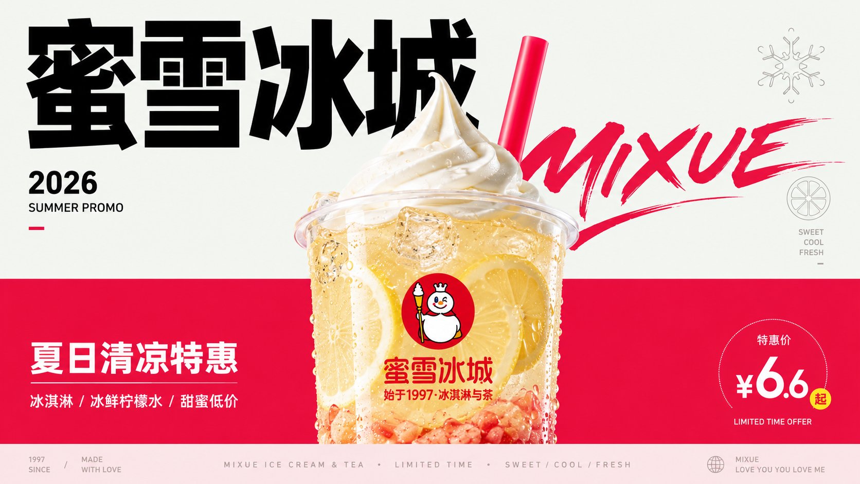
Generate a vertical editorial advertising-style visual poster based on specific theme content, first splitting the theme into two visible fields. The upper part is a lighter, emptier, lower-saturation conceptual air field, carrying the title, lightweight symbols, a sense of the year markers, and reading breath; the lower part is a more saturated, more supportive physical experience field, carrying the main subject, materials, short sentences, and emotional temperature. Maintain a clear hard-cut boundary or an approximate hard-cut color plane transition between the two fields; the boundary line is like a layout structure rather than natural scenery, without using complex scenes to explain the theme. The core object is located on the central axis, slightly lower, and spans the boundary, with the top or outer edge entering the conceptual field and the main mass sinking into the experience field; the edges integrate transparency, reflective relationships, same-color layering, contour compression, and highlight refraction, slightly merging with the two background fields, making the object like a bridge connecting two semantics rather than material pasted on a background color. The highest detail density is only concentrated inside the core object, expressing its material, texture, refraction, particles, internal layers, and touchable realism; the background, icons, and text remain flat, clean, and low-noise. The colors adopt a hierarchical relationship of large-area structural colors, sharp dark text, white or high-brightness highlights, and small-area theme trigger colors; when the theme changes, change the hue and temperature, but maintain the proportion of light upper field, heavy lower field, dark text, bright subject, and small but accurate trigger colors. Let the main title become a graphic structure in the upper half of the image, using strong scale differences, restrained black, and a tough font skeleton, and set a glyph event with more curved tension or high contrast to participate in overlay and rhythm, making the text like a visible trajectory of smell, speed, or emotion. Auxiliary text is compressed into edge annotations, short sentences below the subject, and low-contrast miniature metadata at the bottom; the bottom can form a very shallow information band, ending quietly like a publication footer. Arrange a hollow single-line symbol derived from the thematic semantics in the conceptual field, with simple lines, low density, and serving only as sensory or conceptual evidence. The overall design retains wide white space and asymmetrical balance, with a stable central subject, edge text forming slight pressure, and the bottom information band closing the layout; the first visual glance sees the hard-cut dual fields, the cross-field subject, huge black characters, low-volume symbols, and clean modern graphic order.
——————
Theme for this session: Lu Xun's book "Call to Arms" recommendation poster
Ratio 16:9 landscape