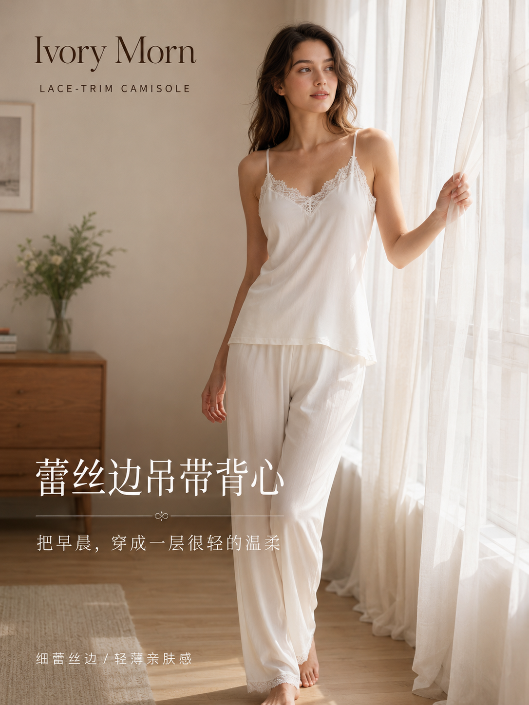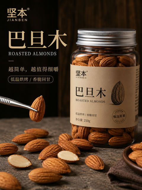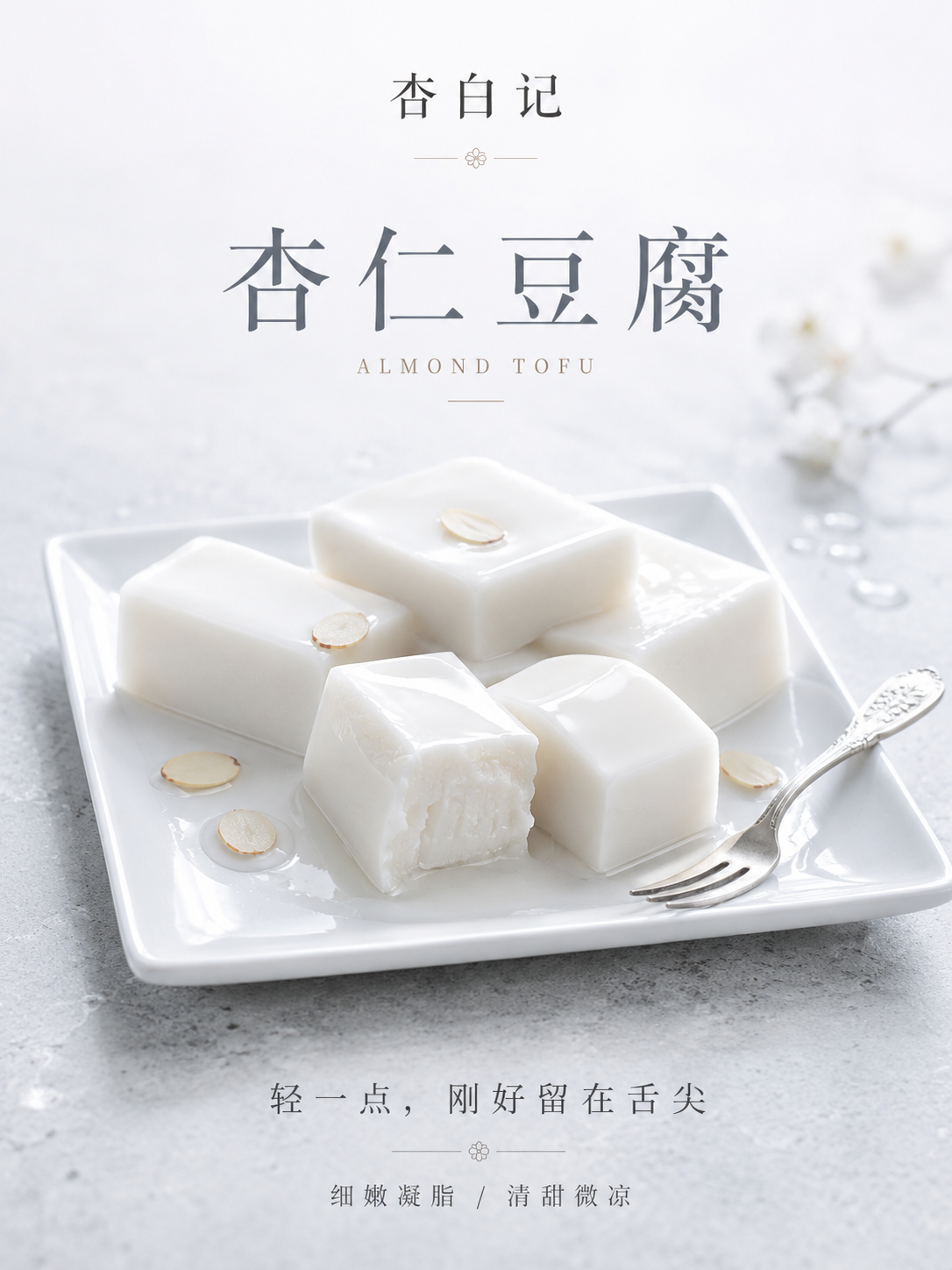
杏白记高端杏仁豆腐凝脂美学海报
🤖 ChatGPT
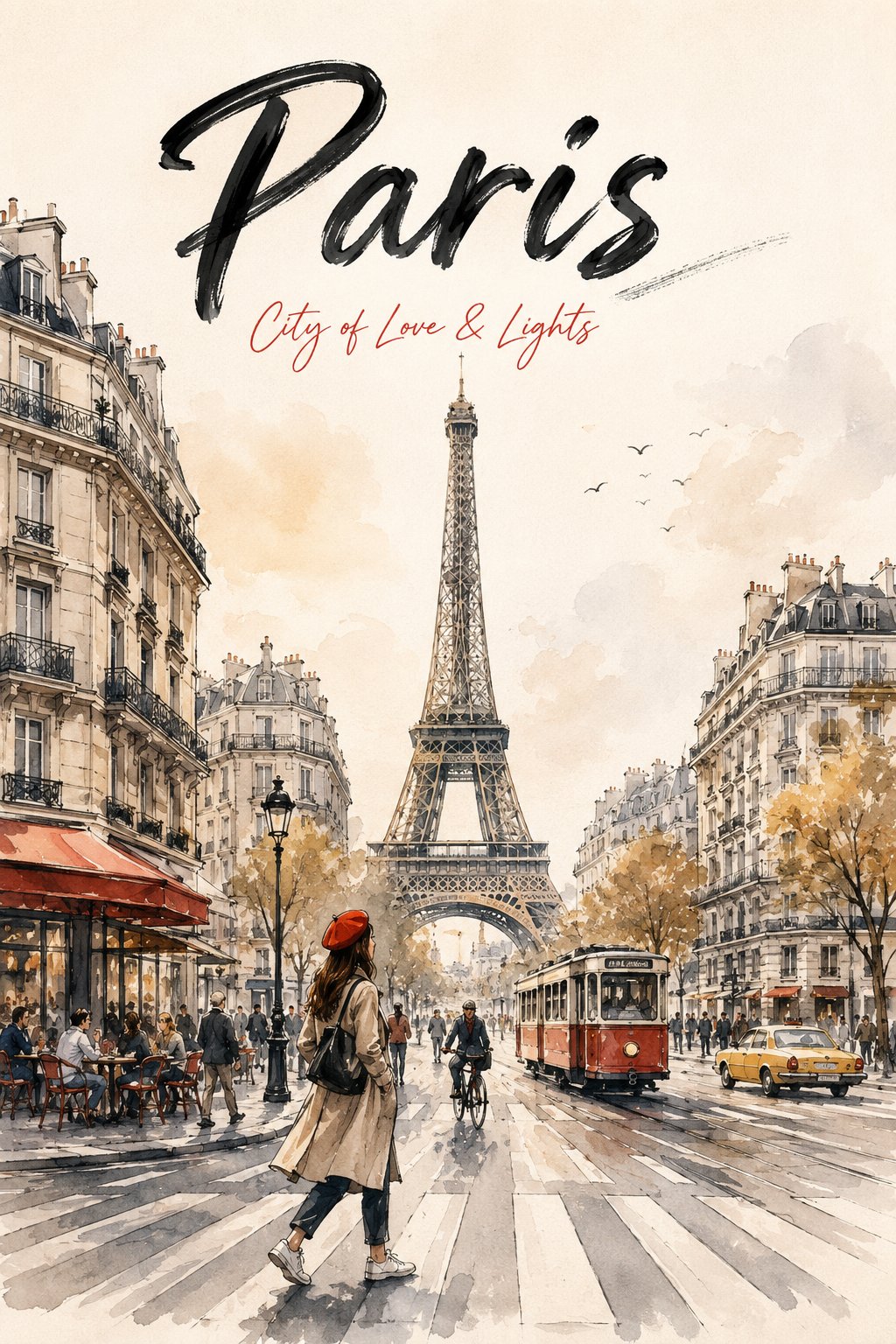
Create a premium watercolor travel poster for {{CITY_NAME}} in a modern urban sketch style. Display "{{CITY_NAME}}" at the top in large black hand-painted brush lettering, with "{{TAGLINE}}" below in elegant red handwritten script.

Feature the city's most iconic landmark perfectly centered, towering above the skyline. Surround it with recognizable local architecture illustrated using expressive black ink sketches and soft watercolor washes.

In the foreground, place a stylish traveler crossing a pedestrian crossing while looking up at the landmark. Add subtle city life (pedestrians, bicycles, taxis, trams, or local vehicles) and strong leading perspective lines.

Style: luxury editorial travel poster, warm ivory textured paper, soft golden-hour lighting, muted gray-blue palette with one city-inspired accent color, minimalist composition, generous negative space, vertical 2:3 ratio, ultra-detailed, museum-quality, 8K, crisp ink strokes, no logos, no watermarks, no borders, no AI artifacts.
为{{CITY_NAME}}创作一张现代城市素描风格的高端水彩旅游海报。顶部用大号黑色手绘刷笔字体显示“{{CITY_NAME}}”,下方用优雅的红色手写体显示“{{TAGLINE}}”。

将该城市最具标志性的地标完美居中,耸立在天际线上。周围环绕着极具辨识度的当地建筑,使用富有表现力的黑色墨水素描和柔和的水彩晕染进行插画绘制。

在前景中,放置一名时尚的旅行者正在穿过人行横道,同时仰望该地标。加入微妙的城市生活元素(行人、自行车、出租车、有轨电车或当地车辆)和强烈的引导透视线。

风格:奢华社论旅游海报,暖象牙色纹理纸张,柔和的黄金时段光影,以灰蓝色调为主并带有一种受城市启发的点缀色,极简主义构图,大量的留白,垂直 2:3 比例,超细节,博物馆品质,8K,清晰的墨水笔触,无徽标,无水印,无边框,无 AI 瑕疵。
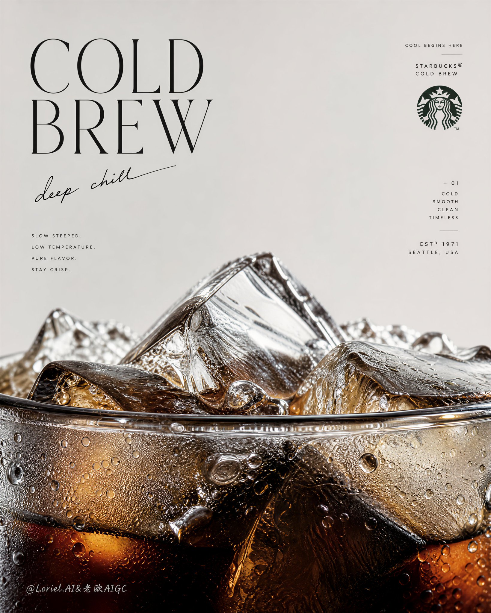
Create an ultra-premium vertical advertising poster for Starbucks Cold Brew, preserving the same minimalist editorial skeleton while pushing the image into a more flagship, more sculptural, and more internationally fashion-magazine-level direction. Keep the composition built from a large field of clean negative space in the upper half and an extreme macro close-up of the cup rim, cold brew surface, and ice structure dominating the lower half. The final result should feel like a hybrid of a world-class Starbucks campaign, a luxury beverage poster, and a collectible international magazine cover: light, cold, precise, modern, and visually unforgettable.

The hero product is Starbucks Cold Brew shown in an extreme macro close-up focused on the very top rim of the cup. The lower half of the poster must be dominated by the cup edge, the liquid meniscus, and a dense frozen landscape of crystal-clear ice rising above the rim. The cup should emerge from the bottom edge of the frame so only the upper portion is visible, making the viewer feel intimately close to the drink. The rim must be hyper-realistic: thin transparent edge, subtle glass thickness, wet reflections, elegant refraction, tiny cold condensation beads, meltwater traces, and perfect surface tension. The cold brew inside must feel dark, deep, and luxurious, with black-brown density, amber undertones, chilled transparency, and beautiful depth beneath the ice.

Push the cold-drink identity to an even more extreme level. The interaction between coffee and ice should be astonishingly rich in detail: large angular ice cubes, fractured transparent planes, trapped air bubbles, melting edges, floating smaller ice fragments, cold condensation droplets clinging to the cup, micro-beads of water, faint cooling haze, and sharp liquid transitions where dark coffee meets thinner translucent zones. The lower macro area should feel like an icy coffee world or a cold-brew geological cutaway, highly tactile and physically believable.

Preserve the same poster logic, but boldly reconstruct the lower beverage zone into a more sculptural and iconic frozen landscape. Let the ice cluster at the rim feel less like ordinary drink styling and more like a monumental cold-brew horizon: cracked clear ice peaks, wet reflective ridges, dark liquid depth below, subtle meltwater channels, and refined tonal separation between transparent ice, amber light, and dense coffee shadow. The drink should feel monumental while remaining product-true and hyper-real.

Refine the upper text system completely so it feels lighter, colder, and more like the cover language of an international design or lifestyle magazine. Use a clean, airy, editorial English title such as "Cold Brew" or "COLD / BREW" with elegant spacing, taller vertical rhythm, and restrained sophistication. Pair it with a short handwritten-style line that feels cool, intelligent, and fresh, such as "deep chill", "slow and cold", "stay crisp", or "cool begins here". Add a very subtle Starbucks siren mark or official brand signature, plus a few tiny editorial fragments or fine-line supporting copy arranged with the intelligence of a collectible magazine cover. Typography must feel black or deep charcoal, crisp, modern, slightly fashion-oriented, and premium, with only the most restrained use of Starbucks green if needed.

The text composition must no longer feel warm or cafe-like. It should feel colder, more airy, more modern, and more internationally editorial. Let the title float with elegant asymmetry, the handwritten note arc gently or lean lightly through the negative space, and small copy fragments behave like magazine-cover coverlines without clutter. The typography should echo the line of the rim and the geometry of the ice below, creating a strong dialogue between graphic design and product form. The upper half should feel spacious, calm, and expensive.

Lighting must be extremely soft, crisp, and premium, with more coolness and brightness than a standard coffee ad. Use delicate highlights on ice edges, refined reflections on the cup rim, wet sparkle on condensation droplets, soft luminous gradients inside the coffee, and impeccable tonal control from deep cold-brew brown to translucent amber to icy clear highlights. Every ice fracture, droplet, and liquid shift must feel macro-photography-grade, razor-sharp yet elegant. The realism must be extreme, but the mood remains clean, quiet, cold, and premium.

Keep the palette tightly controlled: pale cool beige or soft stone background above, deep cold-brew brown, near-black coffee depth, translucent amber light, clear ice highlights, soft silver-gray chill reflections, and only minimal restrained Starbucks green for tiny brand cues. The final image should feel like a world-class Starbucks flagship cold-drink poster and a collectible magazine-cover object at the same time: hyper-real cold brew, monumental ice detail, refined cold editorial typography, minimal official branding, luxury cooling atmosphere, premium print texture, and ultra-sharp detail.

Avoid cluttered layout, avoid too many props, avoid full-cup dominance, avoid muddy liquid, avoid weak ice detail, avoid warm cozy coffee-shop typography, avoid excessive green, avoid cheap poster design, avoid cartoon illustration style, avoid chaotic composition, avoid low-detail condensation.
为星巴克冷萃咖啡(Starbucks Cold Brew)创作一张超高级的竖版广告海报,保留同样的极简主义编辑骨架,同时将图像推向更具旗舰感、更具雕塑感以及更具国际时尚杂志水平的方向。保持构图由上半部分的大面积干净负空间和下半部分占据主导地位的杯缘、冷萃液面及冰块结构的极端宏观特写组成。最终结果应该感觉像是世界级星巴克活动、奢侈饮品海报和收藏级国际杂志封面的混合体:轻盈、寒冷、精确、现代,且视觉上令人难忘。

核心产品是星巴克冷萃咖啡,以极端宏观特写展现,聚焦于杯子的最顶端边缘。海报的下半部分必须由杯缘、液体弯月面以及升起在杯缘之上的致密冷冻晶莹剔透冰块景观所主导。杯子应从画面的底部边缘浮现,以便仅看到上半部分,让观众感到与饮品亲密接触。杯缘必须是超写实的:薄而透明的边缘、细微的玻璃厚度、湿润的反光、优雅的折射、微小的冷凝水珠、融水痕迹以及完美的表面张力。内部的冷萃咖啡必须感觉黑暗、深邃且奢华,具有黑褐色浓度、琥珀色底色、冰冷的透明度以及冰块下美丽的深度。

将冷饮身份推向更极端的水平。咖啡与冰块之间的互动应在细节上惊人地丰富:巨大的棱角冰块、破碎的透明平面、困住的气泡、融化的边缘、漂浮的小冰碎片、附着在杯子上的冷凝水滴、微小的水珠、淡淡的冷却薄雾,以及深色咖啡与较薄半透明区域相遇的锋利液体过渡。下方的宏观区域应感觉像是一个冰冷的咖啡世界或冷萃地质剖面,极具触感且物理上真实可信。

保留相同的海报逻辑,但大胆地将下方的饮品区域重构成更具雕塑感和标志性的冰冻景观。让杯缘处的冰块簇感觉不像普通的饮品造型,而更像是一个宏伟的冷萃地平线:破碎的透明冰峰、湿润的反光脊线、下方的深色液体深度、细微的融水通道,以及透明冰块、琥珀光线和浓密咖啡阴影之间精致的色调分离。饮品应感觉宏伟,同时保持产品真实感和超写实感。

彻底完善上方的文字系统,使其感觉更轻盈、更寒冷,更像国际设计或生活方式杂志的封面语言。使用干净、空灵的编辑风格英文标题,如“Cold Brew”或“COLD / BREW”,具有优雅的间距、较高的垂直节奏和克制的精致感。搭配一行感觉酷炫、聪明且新鲜的手写风格文字,如“deep chill”、“slow and cold”、“stay crisp”或“cool begins here”。添加一个非常细微的星巴克海妖标志或官方品牌签名,再加上一些以收藏级杂志封面的智慧排列的微小编辑片段或细线辅助文案。排版必须感觉是黑色或深炭灰色,清晰、现代、略带时尚导向且高端,仅在需要时最克制地使用星巴克绿。

文字构图绝不能再有温暖或咖啡馆的感觉。它应该感觉更寒冷、更空灵、更现代、更具国际编辑风格。让标题以优雅的不对称感漂浮,手写笔记轻轻地呈弧形或倾斜穿过负空间,小的文案片段表现得像杂志封面导读词而不显得杂乱。排版应呼应杯缘的线条和下方冰块的几何形状,在平面设计和产品形态之间建立强有力的对话。上半部分应感觉宽敞、平静且昂贵。

灯光必须极其柔和、清脆且高端,比标准的咖啡广告更冷、更亮。在冰块边缘使用精致的高光,在杯缘上使用精细的反光,在冷凝水滴上使用湿润的闪光,在咖啡内部使用柔和的发光梯度,以及从深色冷萃咖啡棕到半透明琥珀色再到冰冷的透明高光的完美色调控制。每一个冰块裂缝、水滴和液体位移都必须达到宏观摄影级,锐利而优雅。写实感必须达到极致,但氛围保持干净、安静、寒冷和高端。

严格控制调色板:上方为淡冷米色或柔和的石材背景,深色冷萃咖啡棕、近乎黑色的咖啡深度、半透明的琥珀色光、清晰的冰块高光、柔和的银灰色冷反光,以及仅用于微小品牌提示的最少量克制的星巴克绿。最终图像应同时感觉像是世界级星巴克旗舰冷饮海报和收藏级杂志封面对象:超写实冷萃咖啡、宏伟的冰块细节、精致的冷色调编辑排版、极简的官方品牌、奢侈的冷却氛围、高端的印刷质感和超锐利的细节。

避免凌乱的布局,避免过多的道具,避免全杯占据主导,避免浑浊的液体,避免微弱的冰块细节,避免温暖舒适的咖啡馆排版,避免过多的绿色,避免廉价的海报设计,避免卡通插画风格,避免混乱的构图,避免细节模糊的冷凝。
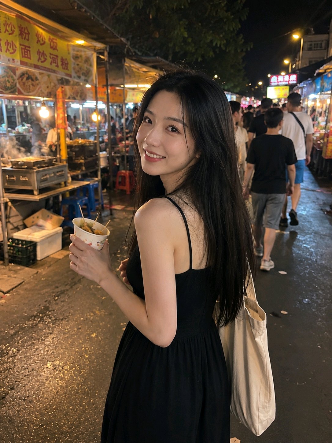
Vertical 3:4, single real nighttime phone snapshot, no collage, no four-grid, no infographic, no text.

Only refer to the facial features, natural smile, and long straight black hair of the woman in the uploaded image. Only refer to the character's appearance, do not inherit the dessert shop, ice cream, seats, clothing, movements, and composition from the original image, completely reconstruct a lively night market scene.

A young adult Asian woman, with a slender and natural build, wearing a simple black spaghetti strap sleeveless long dress, daily and decent style, not revealing. She is walking through a lively night market aisle, holding snacks in a paper cup with a bamboo skewer in one hand and carrying a regular canvas bag in the other. A friend calls her from behind, she looks back at the camera while walking, still chewing, her eyes showing a bit of surprise first, followed by a natural, relaxed smile, like a moment just caught by a friend.

The background is a regular urban night market, with snack stalls, plastic tables and chairs, steaming pots, cardboard boxes, passersby, and partially overexposed light signs. The crowd has slight motion blur, and the ground is slightly cluttered. A mix of warm stall lights, white fluorescent tubes, and street lights, with uneven highlights and slight shadows on the character's face, skin tone is natural but not perfect.

Using a regular mobile phone rear camera, approximately 26mm wide-angle, the lens is slightly lower than the character's eye level, friend shooting while walking. The character is not perfectly centered, the composition is slightly casual, and the background retains a lot of environmental information. Slight noise in the dark areas, partial overexposure of light signs, the image is clear but not over-sharpened, a sense of real night shooting.

Negative prompt: dessert shop, ice cream, wooden table, yellow seats, original image pose, collage, four-grid, multiple scenes, infographic, text, title, poster, cyberpunk, cinematic neon, commercial fashion blockbuster, excessive blur, deliberate sexy poses, exaggerated body curves, plastic skin, heavy makeup, finger deformity, bamboo skewer deformation, floating food, light sign gibberish close-up, watermark.
竖版3:4,单张真实夜间手机抓拍,不要拼贴,不要四宫格,不要信息图,不要文字。

仅参考上传图片中女性的五官特征、自然笑容和黑色长直发。只参考人物外貌,不继承原图的甜品店、冰淇淋、座椅、服装、动作和构图,完全重建热闹夜市场景。

一位年轻成年亚洲女性,身材苗条自然,穿黑色简洁的细肩带无袖长裙,款式日常得体,不暴露。她走在热闹的夜市通道中,一只手拿着纸杯装的小吃和竹签,另一只手提着普通帆布袋。朋友从她身后叫她,她边走边回头看向镜头,嘴里还在咀嚼,眼神先有一点意外,随后露出自然、轻松的笑容,像朋友恰好抓拍到的瞬间。

背景是普通城市夜市,有小吃摊、塑料桌椅、冒着热气的锅、纸箱、路人和局部过曝的灯牌。人群有轻微运动模糊,地面略显杂乱。摊位暖光、白色灯管和街灯混合,人物脸上有不均匀高光与轻微阴影,肤色自然但不完美。

使用普通手机后置摄像头,约26mm广角,镜头略低于人物视线,朋友边走边拍。人物不完全居中,构图稍微随意,背景保留较多环境信息。暗部有轻微噪点,灯牌局部过曝,画面清晰但不过度锐化,真实夜拍感。

负面提示词:甜品店,冰淇淋,木桌,黄色座椅,原图姿势,拼贴,四宫格,多场景,信息图,文字,标题,海报,赛博朋克,电影级霓虹,商业时尚大片,过度虚化,刻意性感姿势,夸张身体曲线,塑料皮肤,浓妆,手指畸形,竹签变形,食物漂浮,灯牌乱码特写,水印。
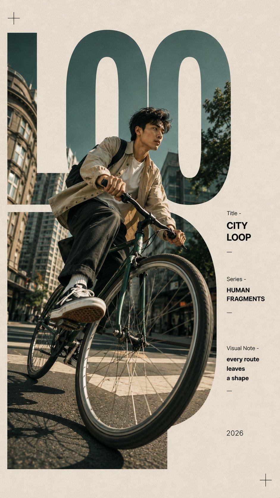
Create a 9:16 editorial typography poster built around one human-centered moment.

Use oversized, cropped letters as the main composition structure. Embed the environment inside the letterforms, while the person, body movement, or a foreground object breaks through the letters with strong perspective. The typography should shape the image, not simply sit on top of it.

Scene: [roller skating / swimming / cycling / coffee break]
Subject: [young Asian woman / Western man / Asian man / Western woman]
Title: [custom two-word title]
Series: HUMAN FRAGMENTS
Year: 2026

4 directions:

1. ROLL SIGNAL — a roller skater gliding past the camera, one skate enlarged in the foreground, body and urban scene passing through giant letters.

2. BLUE CURRENT — a swimmer moving through turquoise water, one arm reaching toward the camera, water and splashes filling and breaking beyond the typography.

3. CITY LOOP — a cyclist turning through a city street, the front wheel enlarged by perspective and visually connected with circular letterforms.

4. BREW PAUSE — a quiet café moment, with the hand and coffee cup closer to the camera while the person and window scene are woven into oversized type.

Use realistic photography, natural skin and fabric, believable water and motion, subtle paper grain, strong negative space, and a restrained color palette.
创建一张 9:16 的社论排版海报,围绕一个以人为本的瞬间构建。

使用超大、裁剪过的字母作为主要构图结构。将环境嵌入字母形状中,同时人物、肢体动作或前景物体以强烈的透视感冲破字母。排版应该塑造图像,而不仅仅是叠在图像上方。

场景:[滚轴溜冰 / 游泳 / 骑行 / 咖啡休息]
主体:[年轻亚洲女性 / 西方男性 / 亚洲男性 / 西方女性]
标题:[自定义双词标题]
系列:HUMAN FRAGMENTS
年份:2026

4个方向:

1. ROLL SIGNAL —— 一位滑旱冰的人滑过镜头,一只旱冰鞋在前景放大,身体和城市景象穿过巨大的字母。

2. BLUE CURRENT —— 一位游泳者在青绿色水中移动,一只手臂向镜头伸出,水和水花充满并突破排版。

3. CITY LOOP —— 一位骑行者在城市街道转弯,前轮受透视影响放大,并与圆形字母形状在视觉上相连。

4. BREW PAUSE —— 一个安静的咖啡馆瞬间,手和咖啡杯更靠近镜头,而人物和窗外景象则融入超大字体中。

使用写实摄影、自然的皮肤和织物、真实的水和动态、细微的纸张纹理、强烈的负空间以及克制的配色方案。
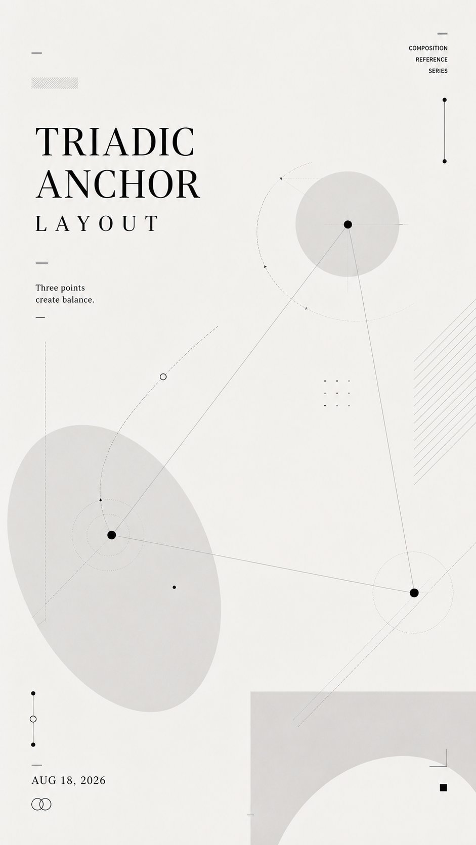
Create a 9:16 vertical composition reference poster.

Layout name: [TRIADIC ANCHOR / NEGATIVE SPACE CHANNEL / LAYERED INTERLOCK / ORBITAL TYPOGRAPHY / CUSTOM]
Core relationship: [balance / negative space / overlap / orbit / tension / flow]
Main title: [TITLE]
Short line: [ONE SHORT SENTENCE]
Date: [DATE]

Use a soft off-white background, charcoal typography, pale gray geometric forms, thin lines, dotted paths, small nodes, and subtle transparent layers.

This is not a tutorial, infographic, or finished commercial poster. It should feel like a designer’s layout study: light, restrained, experimental, and reusable as an upstream visual reference for AI image generation.

Let the title, shapes, lines, and negative space build the composition together. The title position must follow the selected layout logic rather than always sitting at the top.

Keep the text minimal and readable. Use only the main title, one short supporting line, and the date. Do not add numbered steps, design explanations, labels, or long paragraphs.

Make the layout visually rich without becoming crowded. Add enough secondary lines, nodes, transparent shapes, cropping, and overlapping elements to create depth and structure.

The final image should clearly demonstrate the chosen composition through the layout itself, without needing written explanation.
创建一个 9:16 的垂直构图参考海报。

布局名称:[三向锚点 / 负空间通道 / 图层互锁 / 轨道排版 / 自定义]
核心关系:[平衡 / 负空间 / 重叠 / 轨道 / 张力 / 流动]
主标题:[标题]
短句:[一个短句]
日期:[日期]

使用柔和的米白色背景、炭灰色排版、浅灰色几何形状、细线、虚线路径、小节点和细微的透明图层。

这不是教程、信息图或成品商业海报。它应该感觉像是一个设计师的布局研究:轻盈、克制、实验性,并可作为 AI 图像生成的上游视觉参考重复使用。

让标题、形状、线条和负空间共同构建构图。标题位置必须遵循所选的布局逻辑,而不是总是位于顶部。

保持文字简洁且易读。仅使用主标题、一个简短的辅助句和日期。不要添加编号步骤、设计说明、标签或长段落。

在不拥挤的情况下使布局视觉丰富。添加足够的次要线条、节点、透明形状、裁剪和重叠元素,以创造深度和结构。

最终图像应通过布局本身清晰地展示所选构图,而不需要书面说明。
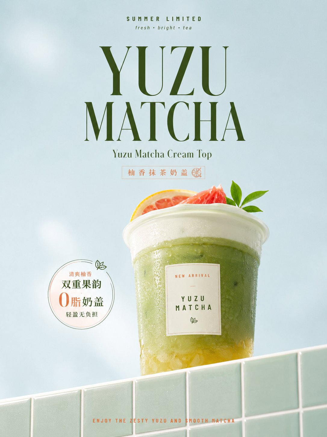
Expand a commercial still life visual with slight film softening around any theme object, placing the single most recognizable object of the theme slightly to the right of the central axis, magnified as the visual center with a close-up real-shot texture; the object rises from behind a tile countertop that cuts in from the bottom edge from low-left to high-right, with its base partially obscured by the countertop, forming a monumental posture steadily held up by the diagonal line. The tile countertop occupies only a small area of the bottom edge of the frame, with a warm glaze and restrained reflections, fine narrow light-colored grouting forming regular squares extending with diagonal perspective, establishing scale while pushing the gaze back to the focus. The upper half retains a large area of transparent white space, using high-brightness, low-to-medium saturation theme-derived cool colors as a clean background, retaining only extremely fine uniform grains, slight brightness drift, and a soft bright mist, overall bright, refreshing, with a slight softness of old-style color advertisements, without adding dirt, wear, or heavy brown filters. The theme object presents credible light transmission, reflection, delicate highlights, and internal layers according to its own materials, with clear edges but not over-sharpened; extract a group of high-saturation, small-volume attachment details from the theme imagery, gathered near the upper edge of the object, with a low-information light-colored rectangular identification surface embedded on the front, letting the rich physical texture and quiet plane form a pause. Colors are derived from the theme semantics, not locked to specific hues: large area backgrounds maintain light, bright, low saturation, medium area objects and tiles share deeper, more saturated adjacent color relationships, a small amount of striking colors concentrated in top details, main titles, and bottom short sentences, light neutral colors used for highlights and identification surfaces; keep clear warm-cold contrast, clean color layers, and a vivid but not glaring focus. Text forms a vertically dense reading along the central axis: two lines of extremely small copy suspended at the top, the first line using a compact bold all-caps narrow font with slightly widened letter spacing, the second line using a lighter, smaller italic font; below it, a very large high-contrast serif title composed of a short theme word, tall face, distinct thick and thin strokes, stable centered positioning, dark color tone echoing the striking details on the object, followed by a line of smaller serif subtitles closely following. Leave a breathing space between the title and the top of the object, text does not press onto the physical entity; the very bottom places a line of small, compact, striking-colored all-caps instructions on the tiles, forming an echo from start to finish. All copy comes from the current theme, maintaining information restraint, central axis alignment, and obvious font size jumps; the image should be like a nostalgic product advertisement shot with natural high-key light after careful arrangement, with both real materials and weak optical softening, as well as bold white space, diagonal platform advancement, and clear graphic order.

——————
Theme: Berry cream dessert cup poster, highlighting a light sweet product suitable for afternoon tea
Supplement: Appear 3 relevant information points, keep commercial poster usable
Aspect ratio: Vertical 3:4
围绕任意主题对象展开带轻微胶片柔化的商业静物视觉,将主题中最具识别度的单一对象置于中轴略偏右,以近距离实拍质感放大为视觉重心;对象从下缘一条自左低向右高切入的瓷砖台面后方升起,底部被台面局部遮挡,形成被斜线稳稳托举的纪念碑式姿态。瓷砖台面只占画面下缘较小区域,釉面温润并带克制反光,细窄浅色勾缝组成规整方格,随斜向透视延展,既建立尺度又把视线推回焦点。上半部保留大块通透留白,使用高明度、低至中饱和的主题派生冷色作为洁净背景,仅保留极细均匀颗粒、轻微亮度漂移与一处柔和亮雾,整体明快、清爽、略带旧式彩色广告的柔润感,不加入脏污、磨损或厚重褐色滤镜。主题对象按自身材料呈现可信的透光、反射、细腻高光和内部层次,边缘清楚但不过度锐化;从主题意象提炼一组高饱和、小体量的附着细节,聚集在对象上缘附近,正面嵌入低信息的浅色矩形识别面,让丰富实体质感与安静平面形成停顿。色彩由主题语义派生,不锁定具体色相:大面积背景维持轻、亮、低饱和,中等面积对象与瓷砖共享更深、更饱和的邻近色关系,少量醒目色集中在顶部细节、主标题和底部短句,浅中性色用于高光与识别面;保持冷暖对照清晰、色层干净、焦点鲜活而不刺眼。文字沿中轴形成疏密分明的纵向阅读:顶部悬置两行极小文案,第一行用紧凑粗体全大写窄体字并稍微拉开字距,第二行用更轻、更小的倾斜字;其下以一个简短主题词构成超大高反差衬线标题,字面高挑、笔画粗细分明、居中稳定,深色字调呼应对象上的醒目细节,再以一行较小的衬线副标题贴近承接。标题与对象顶部之间留出呼吸间隔,文字不压住实体;最底部在瓷砖上放一行细小、紧凑、醒目色的全大写说明,形成首尾回声。所有文案均来自当前主题,保持信息克制、居中轴线和明显字号跳级;画面应像精心布置后用自然高调光拍摄的怀旧商品广告,既有真实材料与微弱光学柔化,又有大胆留白、斜台推进和清晰的图文秩序。

——————
主题:莓果奶油甜品杯海报,突出一款适合下午茶的轻甜商品
补充:出现 3 个相关信息点,保持商业海报可用
画幅:竖版 3:4
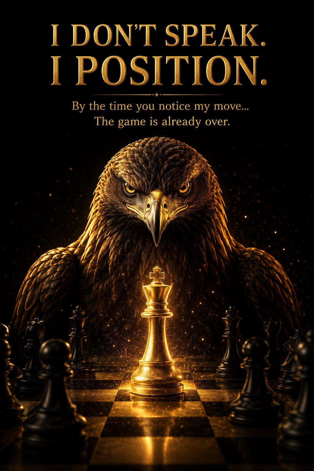
A hyper-realistic cinematic poster featuring a majestic golden eagle standing behind a premium chessboard, its piercing amber eyes locked directly into the camera with an intense, calculating expression. At the center of the board, a glowing golden king chess piece radiates powerful warm light, casting dramatic reflections across the polished black-and-gold chessboard. Surrounding black chess pieces fade into deep shadows, symbolizing defeated opponents. The eagle is partially illuminated with luxurious golden rim lighting, revealing intricate feather textures while the background remains a pure matte black. Floating golden dust particles, subtle volumetric light rays, high contrast, luxury editorial style, ultra-detailed, IMAX-quality, photorealistic, 8K, premium cinematic color grading, minimal composition with generous negative space for typography.

Typography (Bold Luxury Style):

I DON’T SPEAK.
I POSITION. (large metallic gold text)

By the time you notice my move…
The game is already over.
一张超写实的电影海报,画面中一只庄严的金雕站在高端棋盘后,它犀利的琥珀色眼睛直视镜头,眼神中透露出强烈而深思熟虑的神情。在棋盘中央,一个发光的金色国王棋子散发出强大的暖光,在磨光的黑金棋盘上投射出戏剧性的反射。周围的黑色棋子淡入深影,象征着被打败的对手。金雕被奢华的金色边缘光部分照亮,展现出细腻的羽毛纹理,而背景保持纯磨砂黑色。漂浮的金色尘埃颗粒,微妙的体积光线,高对比度,奢华编辑风格,超细节,IMAX画质,写实摄影,8K,高端电影色彩分级,极简构图,预留大量留白以便排版。

排版(加粗奢华风格):

我不说话。
我布局。(大型金属金文本)

当你注意到我的举动时……
比赛已经结束了。