标签: 海报设计

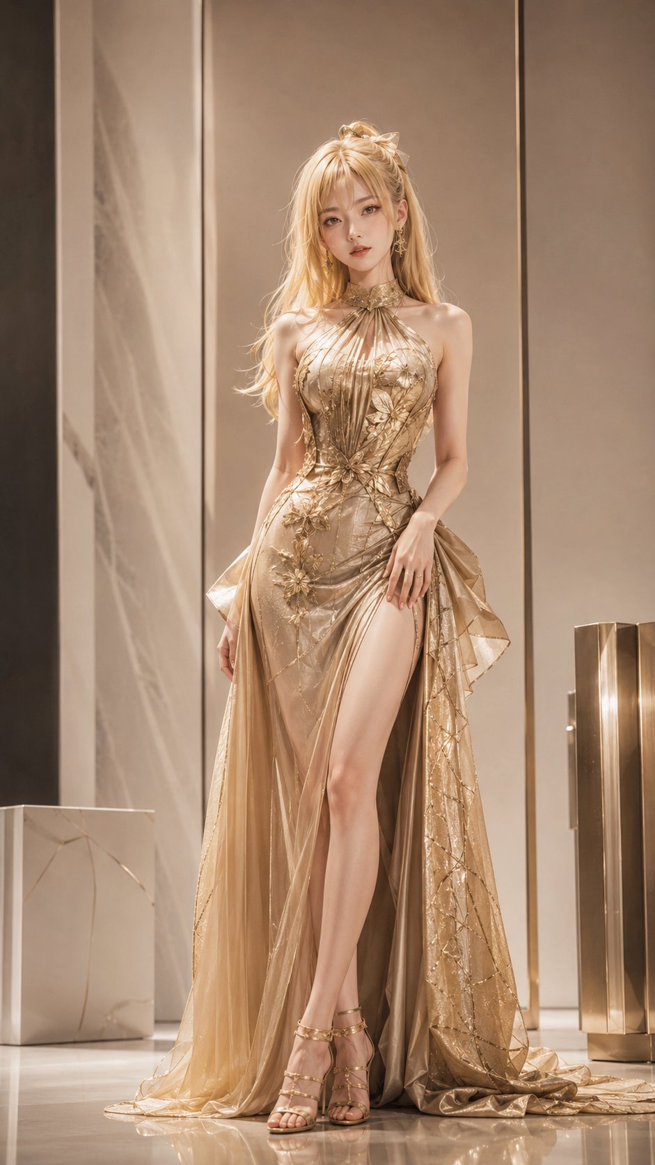
  • 我推的孩子高定时尚杂志海报半写实二次元

    我推的孩子高定时尚杂志海报半写实二次元

    我推的孩子高定时尚杂志海报半写实二次元


    🤖 ChatGPT

    🇺🇸 English Prompt

    Ratio: 9:16
    Style: Semi-realistic 2D high-fashion magazine poster + studio soft light + slight film grain (not street photography documentary)
    Theme: Oshi no Ko girls, assemble~ High fashion cover—four characters from the same work
    Character images must be highly consistent with their images in the original anime, with key hairstyles/hair colors/facial features/temperament/signature characteristics clearly identifiable, avoiding replacement with unrecognizable random faces.
    Female character details: Korean goddess vibe, highlighted milk skin, detailed skin texture & pores & moles, eyes large and clear.
    Characters (all from [Oshi no Ko], one character per image, clearly adult, East Asian aesthetic):
    1) Akane Kurokawa (dark hair, serious and sharp actress temperament—not just Ai Hoshino)
    2) Kana Arima (red hair, stubborn and serious)
    3) Minami Kotobuki (blonde hair, idol stage presence)
    4) Tsuyu Kaburagi (dark hair, calm manager temperament)
    Clothing: Bold and cool high fashion/red carpet/Japan-Korea Fashion Week, high-end feel not erotic
    Composition: Full-body A-pose standing, slightly low camera angle, magazine poster feel
    Constraints: Only Oshi no Ko; semi-realistic 2D; recognizable; no national flags/Rising Sun; no large blocks of readable text

    🇨🇳 中文提示词

    比例:9:16
    风格:半写实二次元高定时尚杂志海报 + 影棚柔光 + 轻微胶片颗粒(非街拍纪实)
    主题:Oshi no Ko girls, assemble~ 高定封面——同一部作品四人
    人物形象须与其在原作动漫中的形象高度一致,关键发型/发色/五官气质/标志特征清晰可辨,避免换成认不出的路人脸。
    女性角色细节:韩系女神感,高亮牛奶肌,detailed skin texture & pores & moles,眼睛大而清透。
    人物(全部来自 【我推的孩子】,每张一个角色,明确成年,东亚审美):
    1) 黑川茜(深色发、认真锐利演员气质——非仅星野爱)
    2) 有马加奈(红发、倔强认真)
    3) 寿美波(金发、爱豆舞台气场)
    4) 镝木露(深色发、冷静经理人气质)
    服装:大胆清凉高定/红毯/日韩时装周,高级感不色情
    构图:全身A字站姿,微低机位,杂志海报感
    约束:仅我推的孩子;半写实二次元;可识别;禁止国旗/旭日;无大段可读文字
  • 极简日系杨枝甘露饮品海报提示词

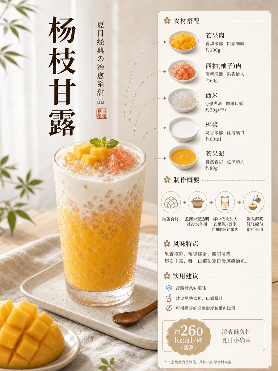
    极简日系杨枝甘露饮品海报提示词

    极简日系杨枝甘露饮品海报提示词


    🤖 ChatGPT

    🇨🇳 中文提示词

    Structured Summary:
    - Type: drink
    - Title: Mango Sago Pomelo (Yangzhi Ganlu)
    - Subtitle: A refreshing Hong Kong-style summer sweet drink interwoven with mango, grapefruit, and sago
    - Core Ingredients: Mango, grapefruit, sago, coconut milk, milk, condensed milk
    - Flavor Keywords: Sweet, refreshing, fruity, milky, chewy, icy
    - Calorie Label: Approx. 260 kcal/cup (Estimated, based on approx. 350-400 ml)
    - Visual Style: ins minimalist style + Japanese cuisine feel
    - Main Image Scene: Scene 2: Japanese menu card style
    
    # Main Image Prompt
    Create a Xiaohongshu-ready 3:4 single-page Chinese drink poster for 杨枝甘露. Use a high-resolution portrait canvas; if a concrete pixel example is needed, prefer 1080 x 1440, but do not hard-code 1024 x 1536 or any 2:3 ratio. Visual style: ins minimalist style + Japanese cuisine feel. Main layout scene: Scene 2: Japanese menu card style. Show a tall clear glass of chilled 杨枝甘露 as the hero subject on one side, with soft mango-yellow and creamy coconut-white tones, visible mango puree layers, pomelo pulp, glossy sago pearls, small mango cubes, and light condensation on the glass. Build the other side as neat Japanese cafe menu cards containing ingredient and seasoning blocks. Include title `杨枝甘露`, a short subtitle, ingredient list, making summary, serving notes, and a calorie badge `约260 kcal/杯(估算)`. Show ingredient sub-images around it with dotted-end bent connector lines. Use pale wood, linen cloth, ceramic tray, restrained summer light, generous negative space, and natural clarity with gentle edges. Avoid harsh sharpening, excessive HDR, plastic gloss, noisy micro-contrast, or crowded milk-tea-ad styling. Chinese text must be large, high-contrast, and readable.
    
    # Ingredient Preparation Image Prompt
    Create a Xiaohongshu-ready 3:4 Chinese ingredient-preparation infographic for 杨枝甘露. Use a high-resolution portrait canvas; if a concrete pixel example is needed, prefer 1080 x 1440, but do not hard-code 1024 x 1536 or any 2:3 ratio. Visual style: ins minimalist style + Japanese cuisine feel. Add a clear numbered header `2 食材准备`. Use a clean rounded-corner layout with colors derived from mango yellow, grapefruit blush, coconut white, and pale wood. Arrange ingredients neatly in separate bowls, glasses, and small dishes: Mango 2 pieces, Sago 50g, Grapefruit half, Coconut milk 120ml, Milk 100ml, Condensed milk 15g, Ice cubes as appropriate. Include one or two simple tool items such as a small saucepan and blender cup if they fit. Use Japanese cafe minimal composition, a wood tray and linen cloth, generous negative space, soft natural light, and clear Chinese labels with quantities under every item. Make all ingredient sub-images clean and legible.
    
    # Making Steps Image Prompt
    Create a Xiaohongshu-ready 3:4 Chinese step-by-step drink-making infographic for 杨枝甘露. Use a high-resolution portrait canvas; if a concrete pixel example is needed, prefer 1080 x 1440, but do not hard-code 1024 x 1536 or any 2:3 ratio. Visual style: ins minimalist style + Japanese cuisine feel. Add a clear numbered header `3 制作步骤`. The background and accent colors must match the main drink poster palette. Show 5 step cards with large rounded-corner process photos and readable Chinese captions: 1. Cook sago and simmer until transparent then rinse with cold water; 2. Dice mango, peel out grapefruit pulp; 3. Blend mango meat, coconut milk, milk, and condensed milk into a fruit pulp; 4. Put sago, mango cubes, and grapefruit into the cup; 5. Pour in the fruit pulp then refrigerate or add ice to enjoy. Step photos should show the full cup, bowl, tray, blender, and prep setup whenever possible. Avoid extreme close-up crops as the main step image. Text must be large and readable. Do not include calories, calorie badges, calorie strips, kcal text, heat labels, or nutrition strips on this third image. Add a subtle bottom CTA box with this sentence: `What do you want to drink next? Order in the comments section, and I will make it~`
  • 品牌全案中文视觉提案板生成指令

    品牌全案中文视觉提案板生成指令

    品牌全案中文视觉提案板生成指令


    🤖 ChatGPT

    🇺🇸 English Prompt

    【Store Type】: 【Fill in, e.g., Offline Retail / Catering / Service Store】
    【Brand Name】: 【Fill in】
    【Store Scale and Location】: 【Fill in】
    【Brand Temperament】: 【Fill in 3–5 words】
    【Main Color】: 【Fill in】
    【Accent Color】: 【Fill in】
    【Core Graphic Language】: 【Fill in, e.g., botanical line art / geometric facets / hand-drawn maps】
    【Main Materials】: 【Fill in 4–6 real materials】
    【Store Core Product or Service】: 【Fill in】
    【Main Title】: 【Fill in】
    【Subtitle】: 【Fill in】
    【Chinese Text Allowed per Image】: 【List per image, the fewer the better】
    
    Use official ChatGPT-Image2 to generate a set of 4 independently outputted 3:4 vertical Chinese brand proposal boards. The four must belong to the same brand system but undertake different business tasks respectively; each image should be a separate output, not a 4-in-1, not a nine-square grid, and do not just change items while repeating the same composition.
    
    First, establish a unified system: use [Main Color], [Accent Color], [Core Graphic Language], and [Main Materials] throughout the four images; use clear modern Chinese fonts for titles; all Chinese characters are natively generated by the model within the bitmap, with few and large characters, each being correct. Unify the light source, material precision, rounded corners, line thickness, and rhythm of white space, while giving each image a different visual focus and reading path.
    
    1st Image | Space Entrance
    Show a realistic and feasible store exterior, storefront, window display, or reception entrance, and supplement with 2–3 close-up key details. The main space occupies more than half of the frame; use brand graphics or a continuous visual line to connect details, do not cut the page into regular small grids. Focus on verifying brand identification, business information, product display, and street visibility.
    
    2nd Image | Products and Packaging
    Show core products or service carriers, as well as packaging, tote bags, stickers, cards, protective sleeves, and other supporting materials. Use packaging unfoldings, structural breakdowns, or continuous material bands to form the composition; clearly represent real textures such as paper, fabric, glass, metal, wood, and plastic. Do not make ordinary e-commerce white background images.
    
    3rd Image | Circulation and Wayfinding
    Use 3D axonometric, top-down space, or clear scene perspective to show the process of customers entering, selecting, being served, and leaving. Supplement with classification signs, process cards, number plates, price tags, or functional wayfinding. Circulation must be reasonable and cannot go through walls; furniture and pedestrian scales must be feasible; do not generate Dashboards or fake UIs.
    
    4th Image | Opening Communication
    Show a main poster and extend it to window stickers, invitation cards, door stickers, and social media vertical images. Offline and online materials must come from the same visual system, but do not include phone frames, platform UIs, like counts, QR codes, discount prices, or fictional URLs. Use paper ribbons, graphics, materials, or light and shadow to connect various materials into a continuous picture.
    
    Composition and Quality Requirements:
    - Each image should only keep 1 main visual, 2–4 auxiliary modules, and enough white space.
    - Text and objects should blend naturally, do not awkwardly paste text, and do not use dense descriptions.
    - Light source and shadow directions must be unified; architectural proportions, packaging structures, perspectives, and item scales must be realistic.
    - Chinese text on packaging, storefronts, labels, and posters must be clearly readable, without generating extra paragraphs or gibberish.
    - The four images should use four types of information architecture: space, structure, process, and communication, respectively; do not copy the same layout.
    - The overall quality should reach the level of a professional brand design company's proposal, showing style as well as how it can be implemented.
    
    Avoid:
    Replicating the theme, industry, items, title rhythm, and iconic composition of the reference images; overhead shots of light gray concrete equipment, huge English serif titles, handwritten ornate initials, stacked ID cards and receipts; nine-square grids, fake UIs, strong e-commerce feel, cheap promotional feel, children's illustration feel, over-saturation, incorrect Chinese, misspelled brand names, deformed objects, repetitive elements, unnatural shadows, and spaces that cannot be constructed.

    🇨🇳 中文提示词

    【店铺类型】:【填写,例如线下零售 / 餐饮 / 服务门店】
    【品牌名称】:【填写】
    【店铺规模与位置】:【填写】
    【品牌气质】:【填写 3–5 个词】
    【主色】:【填写】
    【点缀色】:【填写】
    【核心图形语言】:【填写,例如植物线稿 / 几何切面 / 手绘地图】
    【主要材质】:【填写 4–6 种真实材质】
    【门店核心商品或服务】:【填写】
    【主标题】:【填写】
    【副标题】:【填写】
    【每张图允许出现的中文】:【逐张列出,越少越好】
    
    使用官方 ChatGPT-Image2 生成一套 4 张独立输出的 3:4 竖版中文品牌提案板。四张必须属于同一品牌系统,但分别承担不同商业任务;每张单独成图,不要四合一,不要九宫格,不要只换物品重复同一构图。
    
    先建立统一系统:使用【主色】、【点缀色】、【核心图形语言】和【主要材质】贯穿四张;标题统一使用清晰的现代中文字体;所有中文由模型原生生成在位图中,文字少而大、逐字正确。统一光源、材质精度、圆角、线条粗细和留白节奏,同时让每张拥有不同的视觉重心与阅读路径。
    
    第 1 张|空间入口
    展示真实可落地的门店外观、门头、橱窗或接待入口,并补充 2–3 个关键细节近景。主体空间占画面一半以上;用品牌图形或一条连续视觉线连接细节,不要把页面切成规则小格。重点验证品牌识别、营业信息、商品陈列和街道可见性。
    
    第 2 张|商品与包装
    展示核心商品或服务载体,以及包装、手提袋、贴纸、卡片、保护套等配套物料。用包装展开、结构拆解或连续材料带形成构图;清楚表现纸张、织物、玻璃、金属、木材、塑料等真实质感。不要做普通电商白底图。
    
    第 3 张|动线与导视
    使用 3D 轴测、俯视空间或清楚的场景透视展示顾客从进入、选择、服务到离开的流程。补充分类牌、流程卡、号码牌、价签或功能导视。动线必须合理、不能穿墙,家具与人行尺度可落地;不要生成 Dashboard 或假 UI。
    
    第 4 张|开业传播
    展示一张主海报,并延展到橱窗贴、邀请卡、门贴和社交竖图。线下与线上物料必须来自同一视觉系统,但不要出现手机框、平台 UI、点赞数、二维码、折扣价格或虚构网址。用纸带、图形、材质或光影把各物料连成连续画面。
    
    构图与质量要求:
    - 每张只保留 1 个主视觉、2–4 个辅助模块和足够留白。
    - 文字与物件自然融合,不要生硬贴字,不要密集说明。
    - 光源和阴影方向统一,建筑比例、包装结构、透视和物品尺度真实。
    - 中文包装、门头、标签和海报文字必须清晰可读,不生成额外段落或乱码。
    - 四张分别使用空间、结构、流程、传播四种信息架构,不能复制同一个版式。
    - 整体达到专业品牌设计公司提案级,能看出风格,也能看出如何落地。
    
    避免:
    复刻参考图的主题、行业、物品、标题节奏和标志性构图;浅灰水泥装备俯拍、巨大英文衬线标题、手写花体首字母、工牌票据堆叠;九宫格、假 UI、强电商感、廉价促销感、儿童插画感、过饱和、错误中文、品牌拼错、物品变形、重复元素、不自然阴影和无法施工的空间。
  • 多乐士油漆液体雕塑探戈舞者艺术海报

    多乐士油漆液体雕塑探戈舞者艺术海报

    多乐士油漆液体雕塑探戈舞者艺术海报


    🤖 ChatGPT

    🇨🇳 中文提示词

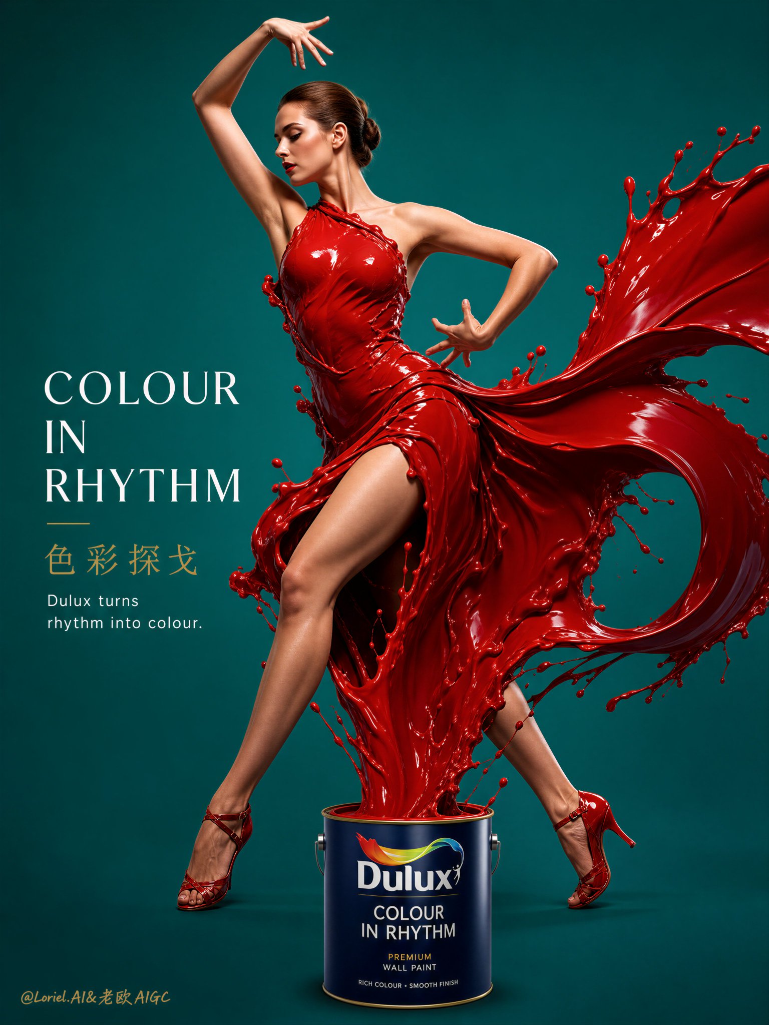
    Create an ultra-premium editorial advertising poster for Dulux, centered on a hyper-real female tango dancer whose dress and sweeping motion trails are formed entirely from sculptural liquid paint rising directly from a Dulux paint can below. The image must feel bold, elegant, dramatic, fashion-forward, and globally premium, with a strong high-contrast pure-color background and a powerful sense of rhythm, tension, and movement. The final result should look like a world-class Dulux campaign poster where color becomes passion, paint becomes couture, and dance becomes visual impact.
    
    Core concept:
    The hero visual is a refined young Western female dancer captured in a rhythmic tango pose full of control, confidence, and mature dramatic energy. Her liquid-paint costume rises directly from a Dulux paint can below and forms both the sculptural body of the dress and the sharp sweeping skirt extensions associated with tango motion. The visual language should feel more sensual, grounded, and directional than ballet: stronger hip line, firmer posture, sharper turning energy, and a more theatrical silhouette. The image must feel iconic, modern, and unforgettable.
    
    Composition:
    Use a vertical luxury poster layout with the dancer placed centrally and slightly above the lower third, creating a commanding, highly readable silhouette. The Dulux paint can should sit near the lower center or slightly offset near the grounded foot, clearly visible as the source of the paint. The liquid paint must rise from the can in a continuous elegant stream, forming the fitted upper dress and dramatic tango-like skirt sweeps around the legs. The composition should feel clean, graphic, and intense, with strong negative space so the gesture and color contrast dominate.
    
    Female dancer:
    Use a refined young Western female model with fair skin, elegant facial structure, healthy graceful physique, and a poised fashion-editorial presence. Her pose should suggest tango rhythm and emotional charge:
    strong grounded supporting leg,
    one leg extending or crossing with precision,
    twisted torso,
    sharp arm line or lifted hand,
    elongated neck,
    and a confident, composed expression.
    She must feel powerful, feminine, premium, and visually magnetic.
    
    Liquid paint tango dress:
    The dress must be formed entirely from hyper-real liquid paint. The paint should create a fitted bodice and a dramatic, asymmetrical tango skirt, with sweeping arcs and directional trails that feel like fabric in motion but remain unmistakably liquid. The paint must be glossy, rich, thick, and physically convincing, with refined edges, controlled splash tension, and elegant sculptural weight. The movement should feel passionate and rhythmic, not chaotic.
    
    Paint source logic:
    The Dulux paint can must clearly act as the source of the entire liquid construction. The viewer should instantly understand that the paint rises from the can and transforms into the tango dress and dynamic motion trails. This physical connection is essential.
    
    Background:
    Use a bold high-saturation pure-color background with no clutter and no scenery. For the strongest tango tension, use a vivid deep teal or saturated emerald-teal background contrasted against a rich crimson-red or lacquered scarlet paint dress. The background should feel flat, clean, modern, and poster-like, intensifying the silhouette and making the liquid dress feel more explosive and luxurious.
    
    Color strategy:
    The paint dress should feel jewel-like, deep, and sensual, using crimson red, lacquer red, or deep vermilion as the main liquid color. The background should contrast strongly through a cool saturated tone such as deep teal or peacock green. Keep the dancer’s skin tones natural and refined so the main chromatic energy comes from the red-versus-teal contrast. The final image should feel bold, artistic, expensive, and globally branded.
    
    Product integration:
    Include a hyper-real Dulux paint can or bucket with clear logo visibility in the lower area of the composition. The can should be sharply rendered, premium, and proportionally balanced within the overall poster.
    
    Typography:
    Use an elegant minimal English-led typography system with a refined Chinese subtitle.
    Suggested text direction:
    Main English title:
    “COLOUR IN RHYTHM”
    or
    “TANGO IN COLOUR”
    Chinese subtitle:
    “色彩探戈”
    or
    “让色彩起舞”
    Supporting English copy:
    “Dulux turns rhythm into colour.”
    Typography should remain minimal, modern, artistic, and beautifully spaced, allowing the figure, paint, and contrast to dominate.
    
    Brand coding:
    Preserve Dulux identity through:
    premium paint can visibility,
    confident use of bold color,
    clean international advertising polish,
    minimal composition,
    and the direct transformation of paint into fashion and movement.
    The overall result must feel like a refined same-series Dulux luxury campaign with stronger drama and emotional punch.
    
    Lighting:
    Use soft premium studio lighting with refined highlights on the dancer’s skin, hair, and liquid paint dress. The red paint must show glossy reflections, sculptural depth, and elegant contour shaping. The figure should remain dimensional and luxuriously lit against the saturated teal background, with no harsh shadow clutter.
    
    Mood:
    bold, dramatic, elegant, feminine, passionate, premium, fluid, fashion-forward, high-contrast, striking, globally branded, minimalist
    
    Rendering style:
    hyper-real Dulux advertising poster, female tango dancer formed with liquid paint dress, saturated contrasting pure-color background, luxury editorial typography, premium studio lighting, international print campaign aesthetic, 8k, world-class image quality
    
    Negative prompt:
    messy paint splash, cartoon dancer, cluttered background, weak Dulux branding, low-detail liquid, cheap fashion ad, rough typography, unrealistic anatomy, muddy colors, weak contrast, low-end poster design
  • 高密度有机蔬菜平面视觉海报

    高密度有机蔬菜平面视觉海报

    高密度有机蔬菜平面视觉海报


    🤖 ChatGPT

    🇺🇸 English Prompt

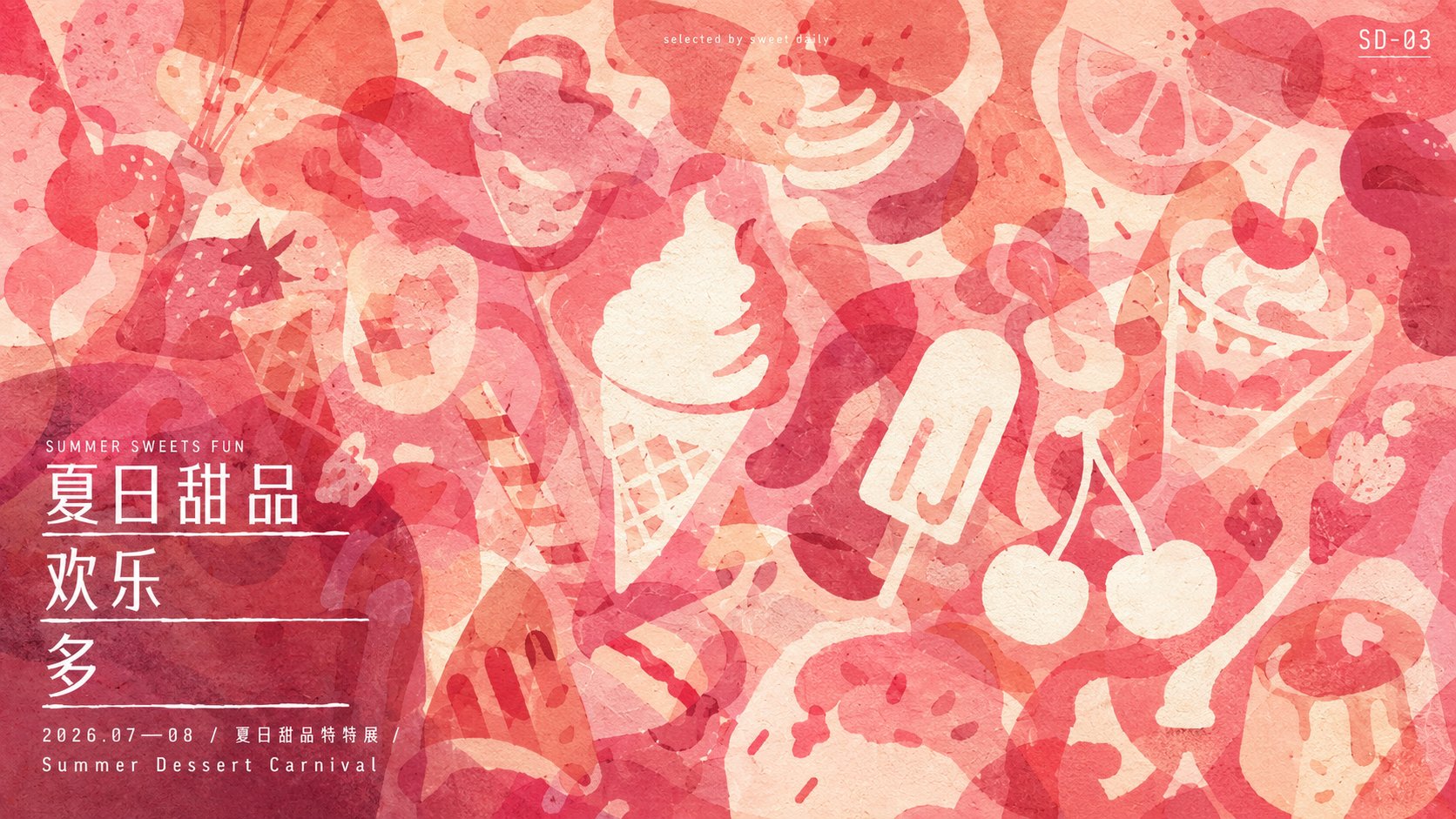
    Establish a high-density flat visual around any subject object, first refining the subject-related forms into flat organic silhouettes of vastly different sizes and varying edges, letting rounded and wide large outlines, slender lines, fine segmented forms, and scattered small pieces reach in from all sides and cross the edges, forming a dense coverage across the entire frame with no obvious perspective. Outlines are layered step by step with transparent ink, the same form repeatedly scaled, rotated, and obscured, naturally generating new color blocks where deep and light shades meet; at the same time, intentionally preserve the irregular bright base color running through them, cutting the most key subject symbols directly from these blank spaces, using only minimalist outer outlines and a few identifying details, making them flicker in and out of view, requiring a second look to be discovered. The blank images and colored silhouettes must share boundaries and intersperse with each other, and cannot become independent icons pasted on the surface. The whole is completed in a way that combines flat paper collage with transparent water-based overprinting: large shape edges are clear but with slight manual cutting irregularities, partially retaining real material textures, fiber feel, fine veins, slight ink layer thickness variations, and overprint color differences, without adding three-dimensional light and shadow, glass texture, or uniform aging. Colors are derived from the emotions, semantics, and material associations of future themes, choosing a dominant hue to form a high-coverage medium-brightness color group, with deeper homologous colors bearing the occlusion and visual weight, lighter low-saturation colors bearing the breathability and paper feel, and a few bright areas close to the base color responsible for separating shapes; controlled within a narrow color gamut, deep colors are full but not dull black, light colors are clean and not overexposed, remaining refreshing, natural, quiet, and full of life after overprinting. The layout adopts asymmetrical balance: graphics fill the screen and are cut at the edges, a readable information area is left on one side below, the subject title is arranged into three to four lines of compact white text, using simple narrow sans-serif and slightly wider East Asian character skeletons, with fine horizontal lines of varying lengths and slight manual skew interspersed between lines; a small foreign language subtitle is placed above the title, and time, place, and description are organized below with a sharp drop in font size, letter spacing is slightly open, and white text is pressed directly onto the dark collage. A small geometric logo is placed on the upper edge of the other side, and extremely small author or column text is embedded in the upper-middle part of the picture, letting information be surrounded by organic forms yet remaining clear. The reading order is first attracted by the full-frame overlapping colors, then discovering the blank symbols, and finally falling to the title below; always maintaining the tension of density, transparency, concealment, and manifestation, avoiding arranging silhouettes into regular patterns and avoiding letting text steal the surprise of negative shape discovery. Theme: Summer garden fruits and vegetables, organic vegetables, poster.

    🇨🇳 中文提示词

    围绕任意主题对象建立高密度平面视觉,先把主题相关形态提炼为大小悬殊、边缘各异的扁平有机剪影,让圆润宽阔的大块轮廓、细长线条、细密分节形态和零散小片从四周伸入并越过边缘,在整个画面形成无明显透视的密集覆盖。轮廓以透明墨色逐层压叠,同一形态反复缩放、旋转、遮挡,深浅交汇处自然生成新的色块;同时有意保留贯穿其间的不规则明亮底色,把最关键的主题符号直接从这些空白中剪出,只用极简外轮廓与少量识别细节,使其忽隐忽现、需要二次观看才被发现。空白形象与有色剪影必须共用边界并彼此穿插,不能变成贴在表面的独立图标。整体以平面纸艺拼贴结合透明水性套印的方式完成:大块形状边缘清楚但略带手工切割的不匀,局部保留真实素材纹理、纤维感、细脉线、轻微墨层浓淡和叠印色差,不添加立体光影、玻璃质感或均匀旧化。色彩从未来主题的情绪、语义与物质联想中派生,选一个主导色相构成高覆盖的中明度色群,以较深同系色承担遮挡与视觉重量、较浅低饱和色承担透气与纸面感,少量接近底色的明亮区域负责分离形状;控制在窄色域内,深色饱满但不闷黑,浅色洁净不过曝,叠印后仍保持清爽、自然、安静而富有生命感。版面采用不对称平衡:图形铺满并在边缘截断,下方一侧留出可读信息区,将主题标题排成三至四行紧凑白字,使用朴素窄体无衬线与略宽的东亚文字骨架,行间穿插长度不一、略带手工偏斜的细横线;标题上方放小号外文副题,下方按字号骤降组织时间、地点和说明,字距稍开,白字直接压在深色拼贴上。另一侧上缘放小型几何字标,画面中上部嵌入极小的作者或栏目文字,让信息像被有机形态包围却仍保持清晰。阅读顺序先被满幅叠色吸引,再发现空白符号,最后落到下方标题;始终保持密、透、藏、显的张力,避免把剪影排成规则纹样,也避免让文字抢走负形发现的惊喜。
    
    主题:夏日菜园蔬果 有机蔬菜 海报
  • 林黛玉与哈利波特清新请柬海报

    林黛玉与哈利波特清新请柬海报

    林黛玉与哈利波特清新请柬海报


    🤖 ChatGPT

    🇺🇸 English Prompt

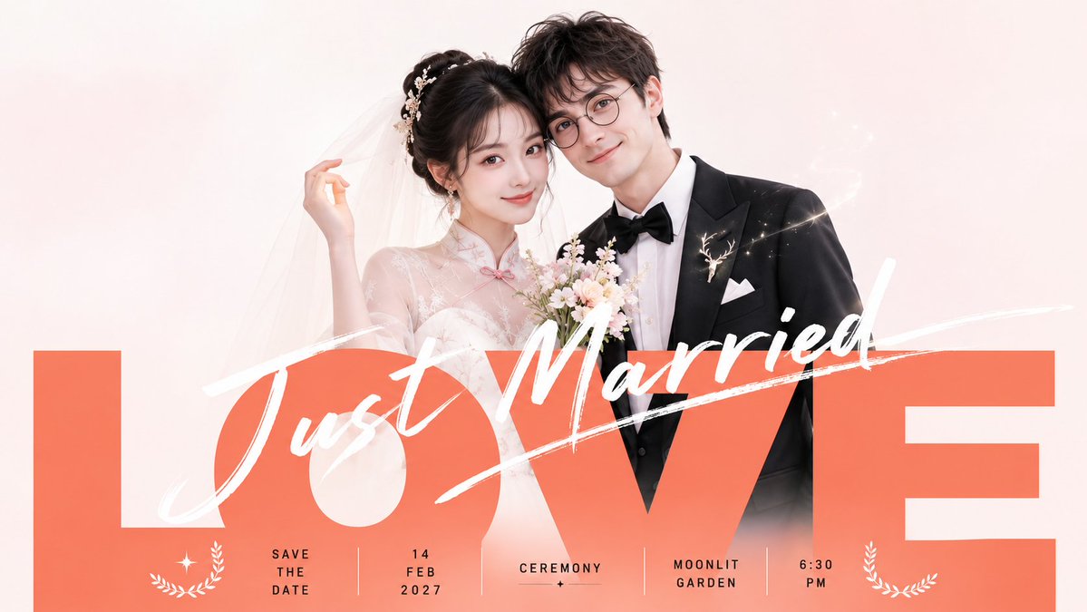
    Centering on specific thematic content, organize the visual frame in a clean invitation style: the upper half features two closely positioned theme objects or characters with a bright studio-shot texture, characterized by slightly playful interactions and clear silhouettes without being overly dramatic; the background maintains large expanses of near-white, light gray, or theme-derived light-colored clean fields, with soft, even lighting and light shadows, making the subjects and text appear as if suspended in clean air. The lower section integrates an oversized wide-body sans-serif main word, heavy-set, tightly kerned, and close to both sides of the frame, using medium-to-high saturation warm or analogous colors from the theme that best express the warmth of celebration, with a matte, flat, and clean finish serving as the heaviest visual anchor; the main word and subjects overlap, with the subjects' lower edges lightly pressing onto the tops of the letters, while the word block supports the figures or theme objects, creating a strong link between the photograph and the poster typography. Above the main word, a high-brightness white handwritten brush short phrase is overlaid, with continuous strokes and a distinct sense of speed, sweeping from the lower left to the upper right across the bold text and subject boundaries, with partial coverage and partial white space, giving the image a relaxed smile within a formal invitation feel. The lower-middle part includes a small amount of thin, narrow small text and date-like short information, organized into several vertical narrow columns with tight character and line spacing in black-gray, acting as a typographic rhythm rather than a manual; small white laurels or linear emblems can be added as decorations for a light sense of etiquette. Colors are derived from the theme: the background carries the largest light-colored area, subject clothing or materials maintain low-saturation neutral tones, the main word carries a small but high-weight celebratory color, white handwritten text provides clear penetration, and black-gray small text offers precise closure. The overall aesthetic remains high-brightness, low-noise, clean, and transparent with sharp edges, avoiding heavy shadows, complex scenes, dirty grain, and excessive decoration that would distract from the immediate impact of the large text.
    
    Theme: Lin Daiyu and Harry Potter wedding photos
    Ratio 16:9

    🇨🇳 中文提示词

    围绕具体主题内容,以清爽请柬视觉组织画面:上半部安排两处亲近的主题对象或人物,采用明亮棚拍质感,动作带一点俏皮互动,轮廓清楚但不过度戏剧化;背景保持大面积近白浅灰或主题派生的浅色洁净场,光线柔和均匀,阴影很轻,让主体和文字都像贴在干净空气里。下半区压入一个超大宽体无衬线主词,字面厚重、紧排、接近画面两侧,使用主题中最能表达庆祝温度的中高饱和暖色或相邻色,哑光、平整、干净,作为最重的视觉锚点;主词与主体发生前后遮挡,主体下沿轻轻压住部分字顶,字块又托起人物或主题对象,形成照片与海报字的强连接。主词上方叠加一行高明度白色手写笔刷短句,笔画连贯、速度感明显,从左下向右上横扫,跨过粗体字和主体边界,局部覆盖、局部留白,让画面在正式请柬感里带轻松笑意。中下部加入少量细窄小字与日期类短信息,分成几组竖向窄栏,字距紧、行距短、黑灰色,像排版节拍而不是说明书;可配少量白色月桂或线性小徽记作为轻礼仪感装饰。色彩按主题派生:背景承担最大浅色面积,主体服饰或材料保持低饱和中性色,主词承担少量但最高权重的庆祝色,白色手写字负责清亮穿透,黑灰小字只做精确收束。整体保持高明度、低噪点、洁净通透、边缘利落,避免厚重阴影、复杂场景、脏旧颗粒和过多装饰抢走大字压屏的第一眼效果。
    
    
    主题:林黛玉和哈利波特婚纱照
    比例16:9
    
    ——————
  • 明亮简约包装感甜甜圈产品海报

    明亮简约包装感甜甜圈产品海报

    明亮简约包装感甜甜圈产品海报


    🤖 ChatGPT

    🇺🇸 English Prompt

    Generate a visual system centered around any subject that is bright, restrained, and has a sense of packaged advertising: the subject content is first distilled into a giant, soft, and approachable central main form, placed close to the center of the frame and clearly overlapping a thin-line frame behind it, drawing the eye into an internal cavity or core white space through radial organization; the cavity maintains the same color scheme or similar brightness as the background, forming a clear figure-ground relationship and Gestalt closure, allowing the viewer to first read a complete, full symbol with a pause before reading the specific subject. The background uses a high-key warm bright color or clean light color derived from the subject's semantics as a large-area single color field; the subject's color is slightly thicker than the background, with subtle grain and soft edges; the light is diffused high-key light, and shadows only lightly press out layers at contact points, keeping the whole clean, transparent, and free of gray or dirty tones. The frame uses dark thin lines, a small amount of vertical or horizontal short copy, and a small circular seal-like information point to establish a traditional packaging order; the main title can use high-contrast Songti or an equivalent stable display font, with a certain glyph or mark echoing the circular structure, but the text must be subordinate to the central main form. Retain the relationship of "giant subject form obstructing the frame, sparse surrounding information enclosure, and bright color field lifting the product mood," avoiding turning elements into scattered collages, thick retro styles, or low-saturation dark posters. This theme: Donut product poster. Aspect ratio 16:9. Note that the above is the content of the first image. Follow the same logic to expand to other color systems and images of other products for this store. A total of 10 products.

    🇨🇳 中文提示词

    围绕任意主题对象生成一种明亮、克制、带包装广告感的视觉系统:主题内容先被提炼成一个巨大、柔软、可亲近的中心主形体,贴近画面中心并明显压过后方细线框架,借由径向组织把视线吸入内部空洞或核心留白;空洞与背景保持同色系或近似明度,形成清晰的图地关系和格式塔闭合,让观者先读到一个完整、饱满、带停顿的符号,再读取具体主题。背景使用主题语义推导出的高调暖亮色或清洁浅色作大面积单一色场,主体颜色比背景略厚、略有细腻颗粒和柔和边缘,光线为漫射高调光,阴影只在接触处轻轻压出层次,整体保持干净、透明、无灰脏感。画面用深色细框、少量竖排或横排短文案、一个小圆章式信息点建立传统包装秩序,主标题可采用高反差宋体或等效的稳重展示字,某个字形或标记与圆形结构呼应,但文字必须从属于中心主形体。保留“巨大主题形体遮挡框架、周围信息稀疏围合、亮色场托起产品情绪”的关系,避免把元素做成散乱拼贴、厚重复古或低饱和灰暗海报。
    
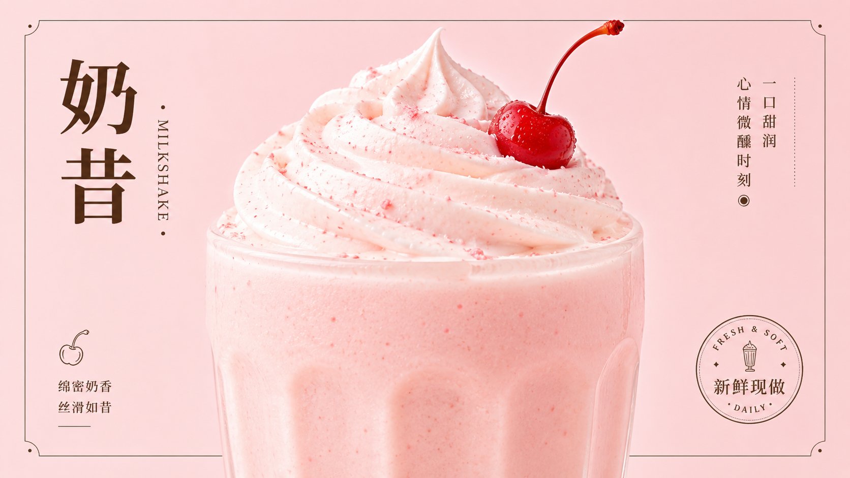
    本次主题: 甜甜圈 产品海报 
    比例 16:9 
    
    ___
    
    注意如上是第一张图片的内容
    
    你同样的逻辑,拓展其他色系,这个店铺其他产品的图片。
    一共10个产品
  • 桥本有菜春日樱花Codex皮肤概念图

    桥本有菜春日樱花Codex皮肤概念图

    桥本有菜春日樱花Codex皮肤概念图


    🤖 ChatGPT

    🇺🇸 English Prompt

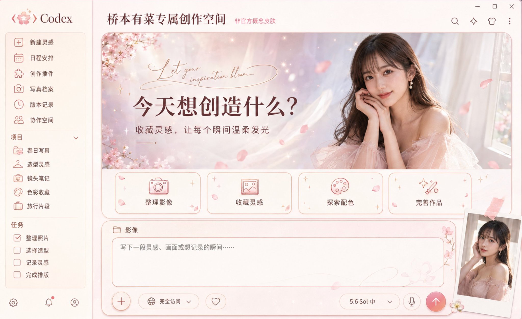
    A high-end Codex desktop application skin concept map with Arina Hashimoto as the character theme, fully displaying the Windows desktop software interface, front eye-level screenshot composition, no perspective tilt. The overall integration of fresh Japanese-style photography, spring cherry blossoms, light luxury fashion magazines, and modern digital creative spaces presents a gentle, bright, exquisite, and romantic but not overly sweet visual temperament; this is an unofficial tribute-style concept design, and official authorization logos do not appear.
    
    The overall color scheme uses cherry blossom pink, cream white, champagne gold, light gray purple, and soft rose brown. Interface materials combine delicate washi paper, translucent tulle, mother-of-pearl, frosted acrylic, and light-colored metal. The background uses soft-focus cherry blossom branches, light pink watercolor smudges, light petals, small starlight, and elegant curves as decorations, paired with the soft natural light of a spring afternoon. All floral elements remain sparse and restrained, highlighting the characters and interface information, without forming a wedding poster or cheap pink sticker style.
    
    A gradient navigation bar of cream white and very light cherry blossom pink is set on the left, with the concise word "Codex" and an abstract icon composed of cherry blossom petals and code brackets displayed at the top. The navigation items are "New Inspiration", "Schedule", "Creation Plugins", "Photo Archives", "Version Records", and "Collaboration Space" in order. The project list below includes "Spring Photos", "Styling Inspiration", "Lens Notes", "Color Collection", and "Travel Snippets", and the task list includes "Organize Photos", "Select Styling", "Record Inspiration", and "Complete Layout". Icons uniformly adopt slender rose gold lines, including cameras, petals, hangers, picture frames, starlight, and folders.
    
    The top of the main content area displays "Arina Hashimoto's Exclusive Creative Space", with "Unofficial Concept Skin" marked in small text next to it. A large horizontal main visual welcome area is set in the center, using soft rounded corners, with the background naturally transitioning from cream white, light pink, and light gray purple, adding tulle light and shadow, bokeh spots, and a small amount of falling petals. The left side retains the title and functional information, and the right side displays a high-quality realistic character portrait of Arina Hashimoto.
    
    The character presents the image of an adult East Asian woman, with recognizable exquisite facial features, black or dark brown long hair, soft bangs, clear natural makeup, and a gentle and confident expression. Wearing a dignified and elegant light pink tulle dress or champagne-colored fashion dress, the neckline and skirt design are appropriate, not exposing, not transparent, paired with small pearl earrings. The character's body is slightly turned toward the camera, hands naturally folded near the chin or lightly supporting the side of the face, the posture is elegant and relaxed, gazing at the camera. Using high-end Japanese fashion magazine photography, soft window light, natural skin texture, delicate hair strands, and shallow depth of field, the character naturally integrates with the interface background.
    
    The left side of the main visual welcome area displays a striking Chinese title "What do you want to create today?", and the subtitle "Collect inspiration, let every moment glow gently". Elegant abstract English handwritten lines are added above the title as decoration, but do not copy real signatures or proprietary wordmarks. The text uses deep rose brown to ensure clear contrast with the light background.
    
    Four cream-white rounded functional cards are arranged horizontally at the bottom of the main visual welcome area, using rose gold fine outlines, light pink icons, and soft shadows. The first card uses a camera icon with the text "Organize Images"; the second uses a picture frame icon with the text "Collect Inspiration"; the third uses a palette icon with the text "Explore Color Matching"; the fourth uses starlight and tool icons with the text "Perfect Works". The cards are uniform in size and evenly spaced, with only a small number of petals and tiny starlight added at the corners, not obscuring the text and icons.
    
    Directly below the main visual welcome area, an independent large horizontal rounded creative panel is set, strictly aligned with the left and right edges of the main content area, close to the full width of the content area, with a height of about one-fourth of the main content area. It must rest stably at the bottom of the page and be a complete, clear, and operable input panel, not a floating chat bubble, narrow search bar, capsule input box, terminal, or independent pop-up window.
    
    The outer background of the creative panel is designed as a gradient from cream white to very light cherry blossom pink according to the character theme, with very subtle washi fibers, pearl soft light, and tulle textures. The edges use slender rose gold outlines and soft light brown pink shadows. The overall color is quieter and less decorated than the main visual welcome area, which is consistent with the Japanese photography and spring cherry blossom themes while keeping the input area clear and legible.
    
    A small folder icon and the partition text "Images" are set in the upper left corner of the outer panel. A wide rounded input area is embedded inside the panel, with clear, slender light rose gold outlines all around, and the internal background is a clean warm cream white, retaining ample white space for writing. The placeholder text is located in the upper left of the input area, content is "Write down an inspiration, a scene, or a moment you want to record...". Only a very light petal watermark and a slender curve are kept in the background of the input area, and decorations cannot enter the main text area.
    
    In the same input panel, a complete bottom control bar is set: on the far left is a circular plus button with a rose gold fine border; next to it are "Full Access" mode controls and a favorite icon; on the right are the model status "5.6 Sol Mid", a down arrow, and a microphone icon; on the far right is a solid circular send button, using a soft rose pink to coral pink gradient, with a clear cream white upward arrow inside. The corners of the panel are only decorated with a small sprig of light pink cherry blossoms, two or three petals, and a small amount of pearl starlight, not obscuring the placeholder text, model selector, or send button.
    
    A slightly tilted vintage Polaroid photo can be stacked in the lower right corner, showing a half-length photo of the character in soft window light, fixed with a short piece of light pink ribbon tape; the photo cannot obscure the important controls of the input panel.
    
    The interface must maintain a real, complete, and operable desktop application structure, rather than a character promotional poster. The character occupies about one-third of the right side of the main visual welcome area, and the left title, four functional cards, and the bottom input panel are clear and complete. Using high-end commercial UI/UX design, precise grids, clear visual hierarchy, loose white space, uniform rounded corners, delicate outlines, restrained shadows, real materials, and Japanese magazine-level color grading. All specified Chinese text is clearly discernible and presents short texts such as "New Inspiration", "Schedule", "Photo Archives", "What do you want to create today?", "Organize Images", "Collect Inspiration", "Explore Color Matching", "Perfect Works", and "Images" as accurately as possible. Ultra-high detail, 4K product display quality, complete window borders, without cropping any important components.
    
    Aspect ratio 16:10
    
    Negative constraints: low resolution, blurred, pixelated, over-sharpened, overexposed, over-saturated colors, cheap pink filters, gaudy studio style, wedding poster style, cartoon idol style, excessive roses, heart stickers, piled up petals, cluttered background, messy interface hierarchy, misaligned components, cropped window, severe perspective distortion, repeated cards, repeated characters, overlapping text, garbled Chinese, random English letters, wrong menu text, bottom input box size too small, input box becomes narrow search bar, capsule-shaped input box, floating chat bubble, input panel detached from the page, input panel becomes terminal or pop-up, missing outer large panel, missing inner input outline, missing bottom control bar, missing circular plus or send button, input area filled with floral decorations, input box uses pure black smoked glass, sexual hints, nude clothing, transparent clothing, lingerie styling, suggestive poses, character face drift, wrong hairstyle, wrong age performance, exaggerated expressions, waxy feeling, plastic skin, wrong body proportions, hand deformities, extra fingers, extra arms, fused fingers, hard edges between character and background, copying real signatures, forging official logos, presenting as official cooperation or officially authorized product, watermark.
    🇨🇳 中文提示词

    一张以桥本有菜为人物主题的高端 Codex 桌面应用皮肤概念图,完整展示 Windows 桌面软件界面,正面平视截图构图,无透视倾斜。整体融合清新日系写真、春日樱花、轻奢时尚杂志与现代数字创作空间,呈现温柔、明亮、精致、浪漫但不过度甜腻的视觉气质;这是非官方致敬型概念设计,不出现官方授权标识。
    
    整体采用樱花粉、奶油白、香槟金、浅灰紫和柔和玫瑰棕配色。界面材质结合细腻和纸、半透明薄纱、珍珠母贝、磨砂亚克力与浅色金属。背景使用柔焦樱花枝、淡粉水彩晕染、轻盈花瓣、细小星光和优雅曲线作为装饰,搭配春日下午的柔和自然光。所有花卉元素保持疏朗克制,重点突出人物和界面信息,不形成婚礼海报或廉价粉色贴纸风格。
    
    左侧设置奶油白与极浅樱花粉渐变导航栏,顶部显示简洁的“Codex”字样以及由樱花花瓣和代码括号组成的抽象图标。导航项目依次为“新建灵感”“日程安排”“创作插件”“写真档案”“版本记录”“协作空间”。下方项目列表包括“春日写真”“造型灵感”“镜头笔记”“色彩收藏”“旅行片段”,任务列表包括“整理照片”“选择造型”“记录灵感”“完成排版”。图标统一采用纤细玫瑰金线条,包含相机、花瓣、衣架、画框、星光和文件夹。
    
    主内容区顶部显示“桥本有菜专属创作空间”,旁边以小号文字标注“非官方概念皮肤”。中央设置大型横向主视觉欢迎区域,使用柔和圆角,背景由奶油白、浅粉和淡灰紫自然过渡,加入薄纱光影、散景光斑与少量飘落花瓣。左侧保留标题和功能信息,右侧展示桥本有菜的高品质写实人物肖像。
    
    人物呈现成年东亚女性形象,具有可识别的精致面部特征、黑色或深棕色长发、柔和刘海、清透自然妆容和温柔自信的神情。身穿端庄优雅的浅粉色薄纱礼服或香槟色时尚连衣裙,领口与裙身设计得体,不暴露、不透明,搭配小巧珍珠耳饰。人物身体微微侧向镜头,双手自然交叠靠近下颌或轻扶脸侧,姿态优雅放松,凝视镜头。采用高端日系时尚杂志摄影、柔和窗边光、自然皮肤纹理、细腻发丝和浅景深,人物与界面背景自然融合。
    
    主视觉欢迎区域左侧显示醒目中文标题“今天想创造什么?”,副标题“收藏灵感,让每个瞬间温柔发光”。标题上方加入优雅的抽象英文手写线条作为装饰,但不复制真实签名或专有字标。文字使用深玫瑰棕色,保证与浅色背景之间具有清晰对比。
    
    主视觉欢迎区域下部横向排列四张奶油白圆角功能卡片,使用玫瑰金细描边、浅粉图标和柔和阴影。第一张使用相机图标,文字“整理影像”;第二张使用画框图标,文字“收藏灵感”;第三张使用调色盘图标,文字“探索配色”;第四张使用星光与工具图标,文字“完善作品”。卡片尺寸统一、间距均匀,仅在边角加入少量花瓣和细小星光,不遮挡文字与图标。
    
    主视觉欢迎区域正下方设置一个独立的大型横向圆角创作面板,与主内容区左右边缘严格对齐,接近内容区全宽,高度约占主内容区域的四分之一。它必须稳定落在页面底部,是完整、清晰、可操作的输入面板,不是悬浮聊天气泡、狭窄搜索栏、胶囊输入框、终端或独立弹窗。
    
    创作面板外层背景根据人物主题设计为奶油白至极浅樱花粉渐变,带有非常细微的和纸纤维、珍珠柔光和薄纱纹理。边缘使用纤细玫瑰金描边与柔和浅棕粉阴影。整体颜色比主视觉欢迎区域更安静、装饰更少,既与日系写真和春日樱花主题一致,又保持输入区域清晰易读。
    
    外层面板左上角设置小型文件夹图标和分区文字“影像”。面板内部嵌入一个宽大的圆角输入区域,四周具有清晰、纤细的浅玫瑰金描边,内部背景为干净的暖奶油白,保留充足空白书写空间。占位文字位于输入区域左上方,内容为“写下一段灵感、画面或想记录的瞬间……”。输入区背景只保留极淡的花瓣水印和一条纤细曲线,装饰不能进入主要文字区域。
    
    在同一个输入面板内部设置完整的底部控制栏:最左侧是带玫瑰金细边框的圆形加号按钮;旁边依次是“完全访问”模式控制和收藏图标;右侧依次放置模型状态“5.6 Sol 中”、下拉箭头和麦克风图标;最右端设置一个实心圆形发送按钮,采用柔和玫瑰粉至珊瑚粉渐变,内部为清晰的奶油白向上箭头。面板边角仅点缀一小枝淡粉樱花、两三片花瓣和少量珍珠星光,不遮挡占位文字、模型选择器或发送按钮。
    
    右下角可以叠放一张略微倾斜的复古拍立得照片,内容为人物在柔和窗光中的半身写真,使用一小段浅粉色丝带胶带固定;照片不能遮挡输入面板的重要控件。
    
    界面必须保持真实、完整、可操作的桌面应用结构,而不是人物宣传海报。人物约占主视觉欢迎区域右侧三分之一,左侧标题、四张功能卡片和底部输入面板清晰完整。采用高级商业UI/UX设计、精确网格、明确视觉层级、宽松留白、统一圆角、细腻描边、克制阴影、真实材质和日系杂志级色彩分级。所有指定中文清晰可辨,并尽可能准确呈现“新建灵感”“日程安排”“写真档案”“今天想创造什么?”“整理影像”“收藏灵感”“探索配色”“完善作品”“影像”等短文本。超高细节,4K产品展示品质,完整窗口边界,不裁切任何重要组件。
    
    宽高比 16:10
    
    负面约束:低清晰度,模糊,像素化,过度锐化,过度曝光,颜色过饱和,廉价粉色滤镜,俗艳影楼风,婚礼海报风,卡通偶像画风,过量玫瑰,爱心贴纸,花瓣堆砌,杂乱背景,界面层级混乱,组件错位,窗口被裁切,严重透视畸变,重复卡片,重复人物,文字重叠,乱码中文,随机英文字母,错误菜单文字,底部输入框尺寸过小,输入框变成狭窄搜索栏,胶囊形输入框,悬浮聊天气泡,输入面板脱离页面,输入面板变成终端或弹窗,缺少外层大面板,缺少内层输入描边,缺少底部控制栏,缺少圆形加号或发送按钮,输入区域被花卉装饰占满,输入框使用纯黑烟雾玻璃,色情暗示,裸露服装,透明服装,内衣造型,挑逗姿势,人物脸部漂移,错误发型,错误年龄表现,夸张表情,蜡像感,塑料皮肤,身体比例错误,手部畸形,多余手指,多余手臂,手指融合,人物与背景边缘生硬,复制真实签名,伪造官方Logo,呈现为官方合作或官方授权产品,水印。
  • 现代极简视觉张力桂花鲜奶茶海报

    现代极简视觉张力桂花鲜奶茶海报

    现代极简视觉张力桂花鲜奶茶海报


    🤖 ChatGPT

    🇺🇸 English Prompt

    Generated around any subject object. The image adopts a modern minimalist and highly visual-tension graphic design layout system. Colors are extracted from the cultural symbols and core emotions of the subject itself, retaining large areas of pure, high-saturation monochrome as the spatial tone, paired with minimalist high-contrast structural colors (such as extreme black, pure white, or clear contrasting colors) to complete image cutting and information hierarchy construction, ensuring the overall tone is bright, pure, and full of vitality, completely abandoning aged, gray-turbid, or cluttered ambient light and shadows. The subject content is transformed into a main visual graphic with spatial penetration, occupying the core focus of the image, and forming strong positive and negative space tension with large areas of blank solid-color backgrounds. Text and additional information layers serve as the skeleton of the image, distributed with precise rhythm, creating spatial interlocking, overlapping, or guiding relationships with the main graphic. The overall texture maintains clean and sharp edges, flat and transparent color blocks, and visual explosive power with a sense of modern order.
    
    ——————
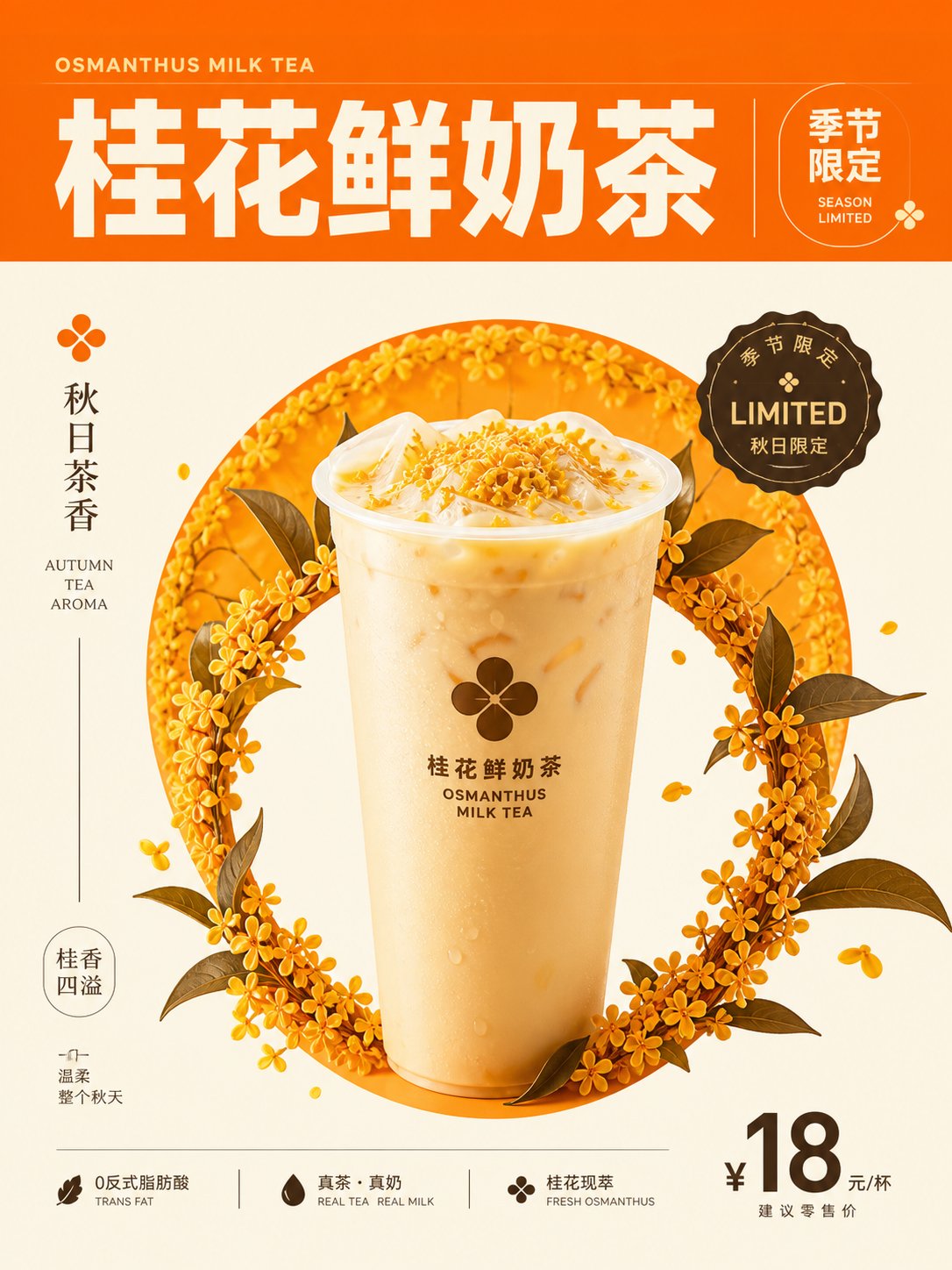
    Limited Subject: Osmanthus Fresh Milk Tea + Autumn Tea Fragrance + Cupped Drink + Limited Edition Logo
    Store Application: Seasonal Limited Drink Promotion Poster
    Warm Colors: Warm Orange + Cream White + Deep Tea Brown + Soft Highlights
    Image Composition: Central Upright Drink Cup + Circular Osmanthus Focus + Top Horizontal Title Area + Vertical 3:4

    🇨🇳 中文提示词

    围绕任意主题对象生成。画面采用现代极简且极具视觉张力的平面设计排版系统。色彩从主题自身的文化符号与核心情绪中提取,保留大面积纯净、高饱和度的单色作为空间基调,搭配极简的高对比度结构色(如极黑、纯白或清晰的对比色)完成画面切割与信息层级构建,确保整体色调明亮、纯粹、充满生命力,彻底摒弃做旧、灰浊或杂乱的环境光影。主题内容被转化为具有空间穿透力的主视觉图形,占据画面的核心焦点,并与大面积留白的纯色背景形成强烈的正负形张力。文本与附加信息层作为画面的骨架,以精确的节奏分布,与主图形产生空间上的咬合、叠压或指引关系。整体质感保持干净利落的边缘线、平整通透的色彩区块以及极具现代秩序感的视觉爆发力。
    
    ——————
    限定主题:桂花鲜奶茶+秋日茶香+杯装饮品+限定标识
    门店应用:季节限定饮品宣传海报
    暖调色彩:暖橙+奶油白+深茶棕+柔和高亮
    画面构图:中央直立饮品杯+环形桂花焦点+顶部横向标题区+竖版 3:4
  • 现代东方极简中国红校庆海报

    现代东方极简中国红校庆海报

    现代东方极简中国红校庆海报


    🤖 ChatGPT

    🇺🇸 English Prompt

    Generated based on specific thematic content. The visual adopts modern Eastern minimalist structural aesthetics, using high-brightness, high-saturation 'China Red' and its analogous colors as the core visual carrier, constructing visual order through large areas of pure color blocks or highly expressive background layouts. The subject is located at the visual focus with clear edge outlines, forming a strong figure-ground relationship with the background. The color system maintains extremely high cleanliness and transparency, creating an extreme contrast between the intense, powerful red and sufficient pure negative space (such as warm white or paper white), rejecting any dirty, aged, dim, or muddy filter effects. Dark colors (such as pure black) are used as an information layer, lines, or anchor points, serving as the skeletal structure. If there are abstract symbols or typographic elements, they must be embedded in the space in an exquisite, restrained form (similar to modern seals or meticulous grid arrangements) to strengthen the overall sense of ritual. The final visual temperament balances Eastern solemnity with modernist precision and crispness, presenting a bright, refreshing, and high-end feeling full of vitality.
    
    ——————
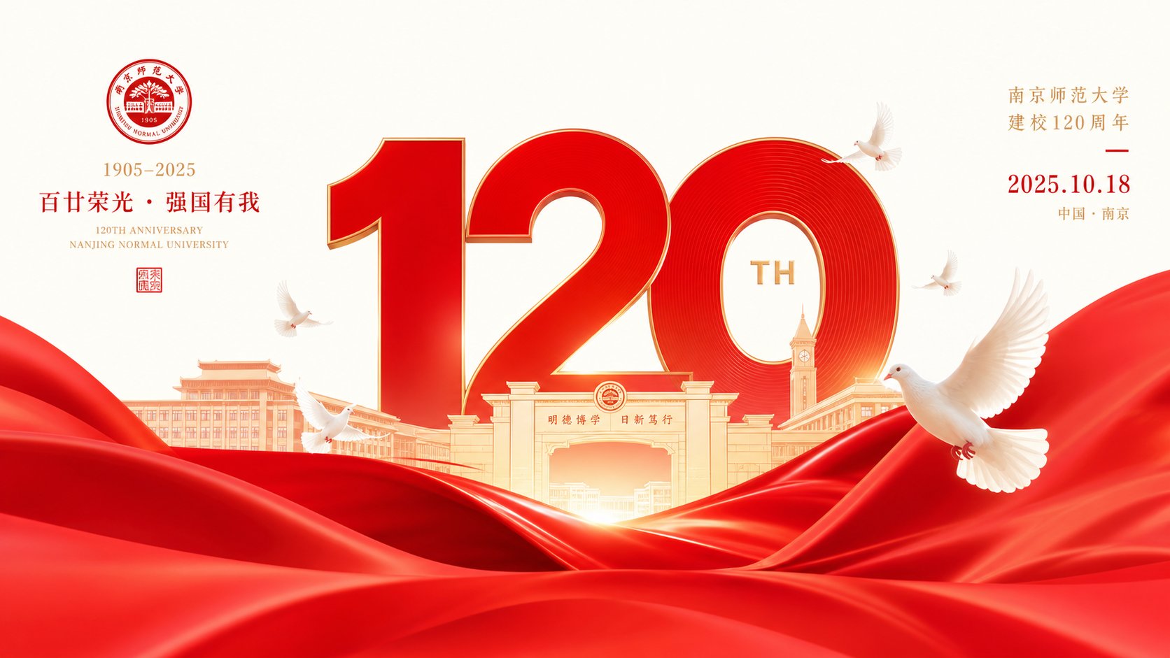
    Anniversary Content: Anniversary numbers + school memorial + white doves + celebration date, used as the main commemorative poster for the school anniversary.
    Ceremony Color Scheme: Vermilion + Warm Gold + Ivory White + Bright High Saturation.
    Main Visual Focus: Super large anniversary numbers centered + red silk foreground support + white doves surrounding the focus + horizontal 16:9

    🇨🇳 中文提示词

    围绕具体主题内容生成。画面采用现代东方极简的结构美学,将高明度、高饱和的“中国红”及其同类色作为核心视觉载体,通过大面积的纯粹色块或极具张力的背景铺陈来构建画面秩序。主题对象位于视觉焦点,边缘轮廓清晰,与背景形成强烈的图底关系。色彩系统保持极高的洁净度与清透感,让热烈有力的红色与充足的纯净负空间(如暖白或纸白)形成极致对比,拒绝任何脏污、做旧、灰暗或浑浊的滤镜感。画面中辅以深色(如纯黑)作为信息层、线条或锚点,承担骨架作用。若有抽象符号或排版元素,需以精致、克制的形式(类似现代印章或细致网格排布)嵌入空间,强化整体的仪式感。最终视觉气质兼顾东方庄严与现代主义的精确利落,呈现出明亮、清爽、充满生命力的高级感。
    
    ——————
    校庆内容:周年数字+校园纪念+白鸽+庆典日期,用作校庆纪念主海报
    典礼配色:朱红+暖金+象牙白+明亮高饱和
    主视觉重心:超大周年数字居中+红绸前景承托+白鸽环绕焦点+横版 16:9